Ew.
|
| |
wtf
|
| |
bwahahahahah
gonna suck so hard
|
| |
needz moar black durrrr
seriously it's not that bad
|
| |
moar opeth? no moar opeth.
|
| |
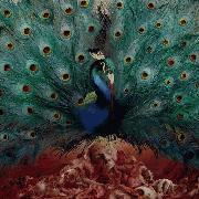
I'm sure the album will rule, but that doesn't make up for the fact that the album art is some of the worst on the face of the earth.
|
| |
At least it's something of a departure from their normal album art.
|
| |
guess i'm the only one who loves the cover art then...
|
| |
no no no
this is beautiful
this is art
|
| |
seriously, that cover is so fucking awesome in its ridiculousness.
|
| |
hahahahah nicely trolled
|
| |
i don't think the art is bad tbh, it just doesn't fit Opeth.
|
| |
Looks so prog
|
| |
even better than Raditude
|
| |
Looks like a symphonic metal cover. Ugh.
|
| |
If the faces weren't in the trees, this would be fine.
|
| |
Errr...
|
| |
I will assume this is a joke cover until the day I have the CD in my hands. Not gonna let this ruin my summer.
|
| |
hahahahah nicely trolled
That's what I'm thinking but I wouldn't put it past Opeth to have cover art like this.
|
| |
looks good to me. something different.
|
| |
I know he has a deep fascination with some older prog works so this wouldn't really be out of the ballpark as far as art. I just don't make that strong a connection to it since they still play well..metal. I guess it still holds relevance.
|
| |
If the faces weren't in the trees, this would be fine.
this
|
| |
If it wasn't for the faces and the city this would be almost okay for another band.
|
| |
oh god. im not sure what this album will be but i doubt it will be more then average... i hope these guys prove me wrong tougth.
|
| |
Finally something fucking different
Good enough
|
| |
There's no way that's real hahaha.
Either way albums still gonna suck.
|
| |
Wizard of Oz anyone.
|
| |
Yeah, cover art is fantastic minus the faces.
I do like like how Per's head is falling off presumably because he's no longer with the band lol.
|
| |
Great now everyone will hate album because of the obscure artwork. i.e. dredg
|
| |
Typical opeth album art
|
| |
Not gonna lie though, minus the stupid face tree i kind of like it.
Way better than the shit they usually do.
|
| |
So predictable. As soon as I heard there was a new Opeth album I went to Photoshop and made this image myself, come on Opeth STOP BEING SO PREDICTABLE
|
| |
obvious troll is obvious
|
| |
Expecting some super prog now.
|
| |
albums gonna suck obvs
|
| |
Part of me feels like this is a joke but to be honest I love it regardless. Let them have some fun.
|
| |
The artwork is so stupid but awesome IMO.
|
| |
Obviously they meant to go for a lighter mood with the art this time.
|
| |
I hope the faces disappear.
|
| |
pffffhahahahahaha oh god it looks so ridiculous
|
| |
"Obviously they meant to go for a lighter mood with the art this time."
Which will probably reflects the music fairly accurately.
|
| |
It would be decent if it weren't for the heads in the tree.
|
| |
I lost interest in this album because of that.
|
| |
I think they were trying to contend with Gaga for worst album cover of the year.
this is goofy as fuck
and yeah what Tyraelxy said
|
| |
Seriously the heads are fine. The burning city in the back is the worst part, the heads are hilarious.
|
| |
"Obviously they meant to go for a lighter mood with the art this time."
Technically Opeth doesn't make their album art, Travis Smith does and then I assume they approve of what he makes.
|
| |
Yes
|
| |
Seems like they stole some Mastodon cover art. Not cool, guys. I feel like this is their way of saying that they're done with the gloom and doom aspects of their music. Crap.
|
| |
Typically a band tells an artist what they want and the artist makes several variations and the band picks one. So yeah, if they told him they want this and approved it then it's probably safe to say tha they meant to go for a lighter mood with the art this time.
|
| |
WTF???? was not expecting this :-s
|
| |
opeth breakn hearts n makn millionsz
|
| |
Losing interest in an album because of the art is a concept that makes me want to smash my head into a wall repeatedly.
|
| |
parody
|
| |
hahahaha what the fuck is that? terrible artwork
|
| |
this album just gets better and better.
|
| |
This artwork kicks ass. You are all stupid noobs.
|
| |
Oh man I hope this is a bad joke. Like everyone else has said, it's the faces and burning city that really send it over the top.
|
| |
I just shot cocacola out of my nose, it burnsss. No way this is real
|
| |
I like it :
|
| |
Yeah this is so predictable *rollseyes*
|
| |
Someone explain how the fuck this is predictable? It's different from anything else they've done...
|
| |
Wow...
If that isn't playing the middle finger card to guys like me who were waiting for another sombre pensive album cover I don't know what is...
|
| |
what the hell were they thinking?
|
| |
Ok, this is the exact opposite of predictable. Predictable for Opeth would be, a dark, dimly lit victorian setting with a strange, ghostly element. This is a crazy homage to 70s prog covers. It's goofy and fun, I don't mind it.
|
| |
obviously he'd know better cuz his name is an opeth song but instead of of its ov
|
| |
derp
|
| |
The album art is really weird but sort of cool in a way.
|
| |
I think what the music sounds like is the most important thing guyzzz, I'm very curious to see what it sounds like.
|
| |
If the faces weren't in the trees, this would be fine.[41254623]
|
| |
The fuck
|
| |
Great now everyone will hate album because of the obscure artwork. i.e. dredg
http://i51.tinypic.com/2hmmzjn.jpg
|
| |
awesome
|
| |
Man, I'm high right now and I just shat myself...
|
| |
Not really liking this.
|
| |
http://i53.tinypic.com/240x7jl.jpg
|
| |
I don't listen to Opeth but this album cover is nuts. It's a total throwback to old records where you would see the band itself plastered all over the artwork. The color scheme is pretty sick. It's also hilariously cheesy.
|
| |
this looks like it should be a much less serious ska album cover, not opeth
|
| |
I like it. It is still not as shitty as the dredg artwork.
|
| |
make that the new opeth picture
|
| |
I'm waiting for the interview which features Mikael's justification of this album art...
|
| |
It's hilarious, but thats not usually the vibe i get from opeth...
|
| |
make that the new opeth picture [2]
|
| |
It's not terrible, I like the actual art, not sure how I feel about the faces yet.... I have a feeling it will grow on me
|
| |
Not gonna lie guys
That picture made me laugh. Really hard.
|
| |
what the fucking fuck
|
| |
There is a lot of symbolism going on here though which I like- the two skulls on the ground are Lopez and Peter, while the pile represents Anders and others, Per's head falling off since he left the band, the new keyboardist represented by the thing above Mikael.
|
| |
I hope this is a joke.
|
| |
In a way, after looking at it for a few minutes, it's kind of cool.
|
| |
holy crap that is truly terrible
|
| |
I've gotta say, I really like it, except for the faces in the tree. That crossed the line between profound and cheesy 
|
| |
Oh, and the woman in red could maybe represent Melinda from Still Life, and the red lake in the background on the left could also represent the same one from Still Life? I'm liking this cover more and more!
|
| |
I want those motherfucking Swedes out of my motherfucking tree!
|
| |
lol rules
|
| |
Hurley Part II.
|
| |
you all fucking suck.
|
| |
lol
|
| |
Wow, that cover is sooooo predictable
|
| |
this is hilarious
|
| |
haha you guys take this shit seriously it rules
|
| |
lmao
|
| |
ahahahaha
|
| |
Its part of an elaborate commercial scheme to make us buy the limited edition with the awesome artwork.
|
| |
Lolbad to the umpteenth degree.
|
| |
hahahaha i love this
|
| |
its not that bad
|
| |
lol. album art is gayer than a bag of dicks
|
| |
jealous
|
| |
HERP DERP PREDICTABLE ALBUM ART HURRRRRRRR
|
| |
it looks like something from a 70s prog wank band that no1s heard of or something
it could rule
|
| |
"no no no
this is beautiful
this is art"
^lol'd so fucking hard
|
| |
he actually thinks that
|
| |
Seriously, though....
Album art rules. Gonna be an awesome album, as per usual.
|
| |
Album art kinda rules tbh, minus the faces
|
| |
its kinda stupid but its cool i guess
|
| |
I just love the fact how people are bitching about the potential for a new sound from Opeth rather than, you know, praising PROGRESSION since Opeth is a PROGRESSIVE METAL band.
|
| |
Don't know if someone posted already but
http://i.imgur.com/908ux.png
|
| |
dude yea
|
| |
Didn't expect that lol
|
| |
There are 10 past members and the keyboardist
10 skulls on the ground
The keyboardist falling off the tree
IT'S THE TREE OF OPETH!! :]
|
| |
what the shit
|
| |
If you look at the band's page here on sputnik the new album art looks so incredibly out of place compared to the rest.
|
| |
barf worthy
|
| |
weird.
|
| |
Someone posted it without the faces? Hm
|
| |
hm
|
| |
omg im afraid to look
why must you do this to me mikael?
|
| |
jus look ramy
|
| |
i dont understand why everyone thinks this cover is supposed to be a joke.
it's metal as fuck.
|
| |
omg its so gay wtfffff
|
| |
that reminded me of that god-awful creed album cover.
|
| |
that wasn't too fancy
more like album fart
|
| |
haha classic mikael akerfeldt. i actually really dig it.
|
| |
thing is I always really liked their album covers, this really doesn't fit with the others at all
|
| |
wait
no faces?
oh k cuz i like the art minus the gay copy/pasta faces
|
| |
ya
|
| |
gonna get on vinyl
even if it sux
|
| |
Some ethereal Kincade like quality to this.
|
| |
hippies
|
| |
gonna get on vinyl
even if it sux
that's what i did with watershed
|
| |
ya except watershed is really good and can i have it?
plz
|
| |
hippies
Is that a bad thing? I'll smoke you out under the table dawg.
|
| |
No you can't have i paid like $30 for it and spun it once clearly i cherish it
|
| |
i can't find it anymore
trade u for blackwater park
|
| |
I already have BWP on vinyl
|
| |
uh uh uh uh
trade u for brand new the devil and god are cajun inside me
|
| |
fucking deal
|
| |
*crysis checks mail
sees coheed vinyl instead
edit: signed by the band
|
| |
i would take a shit on it and return to sender
|
| |
year of the black rainbow special edition signed
|
| |
i am dissapoint
|
| |
ur neva gonna get staffed
cuz you don't like coheed
|
| |
oh well not worth it maybe i'd like em if they released album covers with claudio's face coming out of a tree but no they don't
|
| |
I don't get the hate. There's so many worse album artwork's out there.
They could do without the faces there though.
|
| |
I don't get the hate. There's so many worse album artwork's out there.
They could do without the faces there though.
|
| |
Faces/city need to go. then it'd be cool
|
| |
Ugly album art tends to lead to excellent music. Generally.
|
| |
example
agalloch's last album had great artwork
|
| |
bwahahahahah
gonna suck so hard
|
| |
fuck off ire
|
| |
@Balls
Nah, I'm up for some hellish pyschedelia/prog.
|
| |
well, that was unexpected.
|
| |
it would be sweet without their goddamn heads in the tree.
|
| |
this cannot be real life. like tomr4 said, it would be sweet without their fucking heads on the tree. wtf.
|
| |
Wow, that's hilarious, but sorta cool.
|
| |
Wow, they finally made a bad cover. What the hell is that.
Album better not suck.
|
| |
Get those fucking faces out of that tree. They kill the the picture.
|
| |
If it wasn't for their faces being in the tree...
I mean, subsiding their faces, I love it. But, with the addition of them, I am kind of repulsed. I mean... what!?
|
| |
I don't know the hate for the album cover, it looks like some obscure 70s prog band's cover in contrast with some hell. I dig it.
|
| |
Some hell.
|
| |
Oh, the faces are former members of the band. That's kind of clever actually, though it lacks a certain heir of subtlety. I don't think it was a good design choice but, clever, nonetheless.
Studying this further, this cover is actually really damn cool.
|
| |
I am so happy for you.
|
| |
I love you.
|
| |
Yeah, like many people have said, take the faces out of the tree and it wouldn't be that bad.
|
| |
lmao so hard
the faces are just too much
|
| |
HAHAHAHAHAHAHAHAHAHAHAHAHAHAHA
|
| |
It's a good thing that I have never listened to Opeth for the album art
|
| |
Yeah, good thing.
|
| |
"This picture symbolizes so much. And it makes you think too. Really good album cover guys."
I can't tell if the facebook person saying that is being sarcastic or crazy.
|
| |
If the faces weren't in the trees, this would be fine. [2]
other than that I like it.
|
| |
interesting?
|
| |
My progression throughout the day:
First saw it: ....wat.
A few minutes later: Well, ok, at least they are trying something new with their artwork
About an hour later: Take the faces out of the tree, and this is actually pretty awesome.
Now: I like it a lot, even the faces. It makes me curious about the album- which is a big part of
what any good album art should do. The other purpose of album art is to reflect the sound of the
music itself, and since this cover is so different from any other Opeth cover (everything from the
scene depicted, the band's faces being present, and especially the colors used) I hope they have
taken an interesting new direction and I can't wait to view the album art in context with the music.
If the album ends up being terrible, I can just laugh at how ridiculous the cover is. If it's good,
then I'll appreciate the art even more- And come on guys, it probably will be good. Opeth has a
pretty solid track record.
|
| |
i hate faeces
|
| |
Over-analyzation itt.
|
| |
tl;dr
actually, the awkward spacing is what turned me away from reading that in its entirety. Though, I think most people have a similar progression of thought.
Or think it sucks.
|
| |
*typed
|
| |
bwahahahahah
gonna suck so hard
Yes, because using album art to judge how an album will sound is obviously right....get real.
|
| |
Yeah, idiot, why aren't you real?
|
| |
Holy shit news threads can go onto 2nd pages. mind=blown
|
| |
Opeth news all but guarantees it.
|
| |
Holy shit news threads can go onto 2nd pages. [2]
|
| |
Did deadwing copy/paste that after thinking it over for a while...I wonder.
Anyway album art isnt toooo bad. Probably a reflection of the album which'll focus more on Mike's boner for prog. If they lost the faces this could almost read like a concept album set back in the day. It'll be a quality album.
|
| |
Save Isolation Years, Ghost Reveries was meant to be one.
|
| |
Album art doesnt mean shit on how this will sound, I'm still hopeful for this being good or at least more entertaining than Watershed.
|
| |
I like Opeth a lot, but goddamn that cover sucks. I hope the album isn't as bad.
|
| |
Looks like Sputnik just shed some tears
|
| |
lol at the album cover.
|
| |
this is still going on, huh?
|
| |
I actually hope this is a joke. At first it seemed fine but then I noticed the heads on the tree. It's a cool design don't get me wrong, but I don't think it suits Opeth at all.
|
| |
Its funny, put my username aside I'm an Opeth fan. But the news spewing forth is crazy. New Opeth album announced, news, new Opeth tracklist, predictable news (according to many), new fucking album art, news?? I mean I love Opeth but I never hear this much about any other band.
|
| |
hahahah thats so fucking awesome.
|
| |
i mean i see the significance of the faces but that doesnt stop them from looking fuckin goofy. shouldve just had skulls or apples, or even nothing at all on it.
|
| |
Fucking Rules!!!
|
| |
hahaha Jett I knew youd say that
|
| |
Great now everyone will hate album because of the obscure artwork. i.e. dredg
No, that was a terrible album in general
|
| |
what the fuck is that shit
|
| |
Hopefully this means the album's gonna be prog as fuck. Take the poorly photoshopped faces out of the tree, and it's honestly not so bad.
|
| |
You guys are wack. This is such a cool ass cover, the heads are just kinda lame, otherwise this rules.
|
| |
Haha I get the feeling Opeth saw all the "predictable" comments concerning the title and were like ok.. fuck this.. scrapped their black-and-white misty forest cover, and drew this up. Such a good decision.
|
| |
AWESOME COVER, including the heads. I loved it at first sight. :D
|
| |
Deadwing42, that's a solid first comment.
|
| |
Haha I get the feeling Opeth saw all the "predictable" comments concerning the title and were like ok.. fuck this.. scrapped their black-and-white misty forest cover, and drew this up. Such a good decision. [2]
|
| |
Without the faces it looks much better. Still like a cheesy 70's prog rock Mastodon cover, but not awful.
I guess it's not awful with them, either.
|
| |
i got the same feeling i had when i saw dredg's new album cover
|
| |
Seem like they are moving away from that whole forest obsession.
Even though blackwater park is one of the coolest album covers I've ever seen its kinda cool to see them do something different.
Perhaps mikael was right this time and this album will be totally weird.
I like the way Per is falling out of the tree.
There are some great theories going around about the meaning of the art.
|
| |
lolwut
|
| |
I know what you mean zaru, I seriously thought someone had gotten Opeth and Mastodon mixed up when they posted it.
|
| |
I would NEVER make a mistake when posting something as important as a Sputnikmusic news article.
|
| |
Looks like a Vault-Tec poster from Fallout.
It's going to look really out of place next to the rest of their albums since it features a color pallet of more than three shades of grey.
|
| |
Can't believe all of the dumbass trolls predicting that this album will blow. Seriously, Opeth still has yet to make a BAD album. With a record like that, I doubt this one will be the first, despite the album art.....which is most definitely odd.
|
| |
Can't believe all of the dumbass trolls predicting that this album will blow. Seriously, Opeth still has yet to make a BAD album. With a record like that, I doubt this one will be the first, despite the album art.....which is most definitely odd.
|
| |
hahahaha what are you guys talking about, I may be a biased fanboy.. but opeth cover or not this is fucking awesome
|
| |
fucking hell
|
| |
pretty sure this was made to intentionally piss off the fans
|
| |
"Opeth is yet to make a bad album"
Well, by that logic, each successive good album they make makes it more likely the next will be bad. Just sayin'...
Judgement on quality of album suspended until I hear it. But lolwut cover still.
|
| |
i lol'd
loud
|
| |
lol sorry Crysis if you read that, i was drunk when i typed that and was a bit harsh then. Reading back the get real part made me lol.
|
| |
i dont think the album art is that bad though, i quite like it. I agree about the heads in the tree though, what the hell were they thinking? If they didnt have that then i think overall it would be pretty good.
|
| |
this is going to be a stoner metal album
|
| |
hahahaha this is pretty bad. the sad thing is that it would be decent without the faces
|
| |
Hahahahahaha this is great
|
| |
Guys. Don't judge a band by its cover!
|
| |
it is so 70's!
|
| |
an Opeth stoner metal album would rule. At least it would be something different/interesting.
|
| |
Guys. Don't judge a band by its cover!
Altmer.
|
| |
What about me?
|
| |
i miss you = (
|
| |
Photoshopeth
|
| |
hehe nice
|
| |
I like the way Per's hair is swishing as he falls. He looks like a jellyfish. :D
|
| |
Well it's official, no growling whatsoever on the new album...it got played to some journalists in Sweden, here's a blurb of what they said. Sorry for the shitty translation.
"Levy takes about 56 minutes, and in that time happens a lot. The whole is still tight feel to it.
Things came to mind: Sabbath, The Beatles, Jazz, King Crimson, Cream, Rainbow, Floyd, funk, Purple, Piirpauke, klasari, My Dying Bride, folk, Love, Jethro Tull, Maiden ...
The disc does not have any death metal or örinää. Sound is a 70-figure style, but not very powerful in a modern way kitaravallitettu. Keyboards, piano and mellotron-Meiningen is a strong share of voice in the world. Intro For example, in consultation with double bass and clarinet. "
|
| |
*Sweden and Finland
|
| |
i actually fuckin love it. and if that above comment is true, i can't fuckin wait.
|
| |
"hahaha Jett I knew youd say that"
Haha, I really do think it's pretty cool though. But it would be better without their faces in the tree.
|
| |
I like how the top part is remotely happy and underneath the ground is evil. Maybe it's a concept album ?
|
| |
Does no growls or death metal mean not even any heavy parts? I really wanna fucking hear this
|
| |
One of the worst covers I've seen in a long time
|
| |
It's a throwback to 70's prog, Heritage being their roots etc. Alot of those kinds of sounds are already in their music so it's not like it's unfamiliar territory, but a whole album will be interesting. There are still sections with double bass, mixed with clarinet :P. It may still have some heavy parts, but nothing in the death metal realm. I think this album will divide fans pretty clearly.
|
| |
I actually burst out laughing
|
| |
Unless its the string instrument double bass. Only way it won't divide fans if it isn't terrible. Could be like their Dark Side or something.
|
| |
People are saying the first 7 tracks are really good. Last 3 were decent.
|
| |
People as in the journalist?
|
| |
Him along with the others who've heard it.
|
| |
Gotcha. We'll be the judge of that ourselves I suppose.
|
| |
Precisely.
|
| |
haha im sure the faces are just a joke, but i wouldnt mind a full out prog/phychedelic/stoner album. Opeth will still play the heavy stuff live so im not worried about growls and double bass that much.
|
| |
This album art is gonna be one of the most memorable of the year
Good trolling, Opeth, good trolling
|
| |
Really fucking hoping that it's a joke, but in the end it doesn't matter. Music will still be really good.
|
| |
correction, im diggin the faces. its good to have some humour instead of pure metal evil.
|
| |
I mean I kinda like it...
It's Opeth, it'll fucking rule.
|
| |
this cover is so 60s-70s prog its unbelievable
|
| |
lolpeth [2]
|
| |
"Photoshopeth"
LOL
|
| |
This news needs moaropeth.
|
| |
288 comments... oh god, i can't even imagine how many comments there will be when they finally release a song from this thing...
|
| |
garbage album art
|
| |
Let's make it 3 pages!
|
| |
Album will basically be Lotus Eater breakdowns and Burdens. Best part is, it will probably piss off all the serious and dark 'metalheads'. I bet Mikael is laughing himself silly seeing their 'predictable' reactions.
|
| |
maybe he'll include a devin townsend cameo and let him do one of his unfunny fart jokes or alien impressions.
|
| |
It does (in a satire - y kind of way) remind me of older progressive rock album covers.
|
| |
"Album will basically be Lotus Eater breakdowns and Burdens."
This is pretty much what it'll be.
|
| |
Didn't mention it, but yeah those two and probably the first part of Hessian Peel (the shuffle bit with strings). Looks promising on paper, if one can look past that there (apparently) are no growls.
Looks like Opeth pulled a PtH and a dredg. By sputnik standards this should already be doomed.
|
| |
Yea there's none. I'm worried this big a change in their sound will result in people hating it. But we'll see, I mean Damnation sits at a 4.2 so you never know.
|
| |
I liked the softer direction they took on Watershed, so I might give this a listen when it comes out, but Opeth is one of those bands that I've stopped being particularly enthusiastic about. Album art could be much better (the burning city in particular looks out of place), but I like the 70s prog feel to it.
|
| |
Has it occured to any of you that there are 11 skulls on the ground and that Opeth has exactly 11 past membres since its formation? Also, whose head is it that's falling off the tree...? Yes, Per's one. Coincidence? I think not. Maybe all of this has a link with the title of the album; heritage. I think this is getting very interesting. This artwork is causing quite a stir and I wouldn't be surprised if this was Akerfeldt's intentions all along. Well played, sir...
|
| |
I think that was mentioned earlier in the thread. Pretty cool.
|
| |
No growling?? T.T
|
| |
"maybe he'll include a devin townsend cameo and let him do one of his unfunny fart jokes or alien impressions".
Album could be good, but not THAT good.
|
| |
Album cover looks like something coming out of a doom stoner band.
The 5 faces issue is really intresting, and this is not a work of art I'd exepct from the almighty Travis Smith. Need to get used to.
|
| |
Commence 300 comments of disgust.
300, not entirely in disgust though. Still eerily accurate prediction.
I can't help but smile though. Two steps ahead, this was Åkerfeldt's way of showing how 'predictable' Opeth is haha. Suck it up assholes!
|
| |
it would be good without the faces
|
| |
lol 2 pages of comments
|
| |
Dude it's album art
srs business
|
| |
Lol this is pretty funny but why do people always insist an album will suck because of cover art?
|
| |
I bet this is Mikael playing one of casual jokes, the guy has a wicked sense of humour.
|
| |
Lol IRL @ all the people taking this album cover seriously. Anyone who has ever saw an Opeth concert will know how Akerfeldt likes to joke around. You've all just been trolled.
|
| |
You guys do realize how expensive and ridiculous it would be to hire an artist to make an artwork you have absolutely no intent on using, right?
|
| |
You've all just been trolled
Yeah, I can TOTALLY see a man (Akerfeldt) that takes his passion and career so seriously spending time, money, and his art/craft on something he knows everyone will think is silly in an attempt to "troll" his fans in real life.
Good call.
|
| |
"Yeah, I can TOTALLY see a man (Akerfeldt) that takes his passion and career so seriously spending time, money, and his art/craft on something he knows everyone will think is silly in an attempt to "troll" his fans in real life.
Good call."
lol yeah lol
|
| |
Josh wins.
/thread
The mention of no harsh vocals is kind of upsetting to me. Thinking back, I real seeing an interview in which Akerfeldt mentioned the band detracting from their roots, to appeal to a 'softer' style, which has been an obvious progression in their discography really. Sad, I was really clinging hope to the rumors of Heritage returning to the Black/Death roots.
Still anticipating this, greatly.
|
| |
Not sure how legit the source is, but someone else just confirmed the "lack of death metal content" on the new record, and this...
"-Mikael said that he's been bored of death metal since 90's and its time is over for Opeth, and he's wanted to do this kind of album since when he was 20"
|
| |
He's said for a while he wanted to record his own acoustic album at his home studio. I really want to see that happen, but it's always Opeth stuff and/or Steven Wilson collaborations. New Opeth is cool, but I want to see him make an acoustic album.
|
| |
It looks awesome, reminds me of Yes for some reason. I get a feeling this album will be a little more proggy than Watershed.
|
| |
I agree so hard Josh D
|
| |
sucks :/
|
| |
nah
|
| |
The more I look at this, the cooler it gets. Even though the heads are really goofy, the ex-members skulls and Per falling off the tree are really nice touches. I just hope the already glaring prog influence doesn't go over the top, to the point of parody. Looking forward to hearing it.
|
| |
If Mike was "bored of" Death Metal in the 90's then why would he form a Progressive Death Metal band in the 90's and pump out four Death Metal centric albums in the 90's? Doesn't add up.
As much as I'm in the mood for a good Metal album right now, I'll take a clean-vocal Progressive record... by all means. Damnation was Amazing.
Seems like it's going to be extremely experimental and progged-out, though. I'd be surprised if it ended up being Damnation Part II.
|
| |
Wut.
|
| |
yeah i seriously hope this is a joke. at least the faces must be just for promotional purposes
|
| |
and who said no growling?! o_O
|
| |
Def no growling, is that that hard to digest? This isnt a joke album cover, its legit.
|
| |
ILikeBitchingAboutEverythingBecauseIThinkIAmAMusicCritic.com
That's what this website should be called.
|
| |
It's been a few days.
Starting to think this isn't a joke.
WAKE ME UP PLEASE
|
| |
opeth has got balls to put a cover like that,even if the faces were supposed to be a joke or not...i love metal but it doesn't mean that every metal album should have grim pictures,but that being said, i didn't enjoy watershed,hoping that this would be better.......{^^}
|
| |
will so be 70s prog.. and thats great
|
| |
http://opethforum.com/showthread.php?t=11177
Joakim Svalberg is the new Opeth Keyboardist (still not a permanent member, though)
He's played with Yngwie and QOPH.
|
| |
he played left wing for the hartford whalers, too
|
| |
New Information about the Heritage:
-The album was played to journalists in 5.1 surround sound
-NO death metal or growling
-Some bands or styles the album reminded the journalist of: Sabbath, Beatles, jazz, King Crimson, Cream, Rainbow, Floyd, funk, Purple, Piirpauke, classical music, My Dying Bride, folk, Love, Jethro Tull, Maiden…
-Mikael said that he's been bored of death metal since 90's and its time is over for Opeth, and he's wanted to do this kind of album since when he was 20.
This makes me want to listen to it even more. Mikael has Bloodbath for Death Metal.
|
| |
sounds like opeth has found a new way to bore the shit out of me
stoked
|
| |
@Cracketheskull...I could imagine that he could've gotten bored around the time he was writing Still Life, seeing how there are a lot more progressive edges over the immediate death metal sound (and especially how there albums seemed to continue in that more-so progressive direction). He likely felt he had found his niche in the music world, and didn't even have his feet planted yet, so he obviously didn't want to change the music styling of Opeth so drastically as to completely get rid of what was making him, and Opeth, somewhat successful to begin with. He stated in an interview that the band was pretty unsuccessful, and the members all had full time jobs, until a bit after Blackwater Park. Obviously none of us would like to think that a record label would have much say in the "direction" of a band as great as Opeth, but i'm sure that is a big factor in why Mikael hadn't done this before now.
For once(because having Nickelback on your label is bad enough ;P), I give props to roadrunner. If Mikael really has had this idea in mind for a while, and the label finally has enough faith in Opeth, and the fan base, to let the band do something this drastic to (possibly) alienate a vast amount of fans, it has to be good. No question about it really.
|
| |
I found this translation of the journalist, or whatever, that got to hear it.
Even poor albums have a tendency to sound good when you get to hear them during a pre-listening session.
With that being said, I have to say that the new Opeth album sounds damn good.
Facts:
The record was played in 5.1 surround sound. "I heard the album for the first time this way today and I didn't know that the record would be played this way for the label directors. I had a premonition that it would but in the end I got goosebumps from hearing it this way" said Mikael Åkerfeldt.
The 5.1 mix works well even though I'm usually against listening to rock in any other way than in stereo. Mikael seems to think so as well.
The album is about 56 minutes long and during that time there is a lot going on. It feels complete.
Things that spring to mind during my listen: Sabbath, Beatles, jazz, King Crimson, Cream, Rainbow, Floyd, funk, Purple, Piirpauke, classical music, My Dying Bride, folk, Love, Jethro Tull, Maiden…
The albums does not remind me of death metal or growling.
The sound reminds me of the 70's where modern guitars haven't become the focal point.
Synth, piano and mellotron are big parts of the overall sound. In the intro, for example, you can hear contra-bass and clarinet.
"We don't care what other people think" says Åkerfeldt. "and if the death metal fans don't like it, it's their problem".
The frontman also says he grew tired of the "growl metal" as early as the 90's, but can't really explain why earlier Opeth album have had growls in the songs.
The death metal days are over. At least for now.
"I've been wanting to do an album like this since I was in my twenties", explains a satisfied Åkerfeldt.
When the label management listened to it they didn't have anything bad to say at all. People can make up their own minds this fall if this is saying something about the critics or the album itself".
In any case, if you like older stuff from the 70's you will like this album, I can say that much having only heard the record once.
The first seven songs are awesome and the last three are average.
|
| |
Like it or not, you have to admire and respect Akerfeldt for doing what he wants and not giving a fuck what anyone else thinks. He is a true artist.
|
| |
Like I said, this'll be a solid album. Cant wait.
|
| |
Seriously don't think the album art is bad at all, aside the band member's heads on the tree.
|
| |
Seeing this new interview and stuff, I'm not excited at all. Damnation bored me to tears. I really can't take an album without heavy stuff. The whole reason I like Opeth is because they so perfectly balanced Death Metal and acoustic parts.
|
| |
I dunno Wheelah, you should definitely give it a chance. I definitely don't think this is gonna be Damnation II...there's no death growls, but there will likely be eletric guitar playing, and I think the "brutality" it will be replaced with "density" to contrast the lighter acoustic interludes. I'm excited to see how Mikael takes his expertise of "balance" and utilizes it in this direction.
I think you and I both are the only ones excited for this album MetallicOpeth, ha
I am a bit discouraged that they may never do a "metal" album again, but lets just have faith that if Akerfeldt thinks its good enough to base the rest of this career off of, i'm sure it is.
|
| |
"The whole reason I like Opeth is because they so perfectly balanced Death Metal and acoustic parts."
Check out Ikuien Kaamos, "Fall of Icons" LP. It's almost a carbon copy of Opeth, with a heavier dose of Black Metal tossed into the mix (most prominent through the vocalist 'shrieks'). It even contains clean vocals which sound like a slightly higher key Akerfeldt.
|
| |
what is an Opet
|
| |
This got a lot of comments.
|
| |
Some say it has too many comments.
|
| |
htepo raom
|
| |
He was one of my favorite growlers. RIP Mike's old voice.
|
| |
All of you STFU. It's fucking Opeth artwork. The music probably won't be like the cover.
|
| |
my dying bride's "the angel.." didn't have any growls, and was far from not being an heavy album.
I'm sure Mike did something different from Damnation (the cover alone is reason enough to believe that).
|
| |
I think this is gonna be somethin along the lines of his project about 10 years ago with Dan Swano called Sorskogen...I can dig that.
|
| |
http://www.youtube.com/watch?v=IsKQuKgy1H4
|
| |
wtf, get rid of the faces in the tree and its cool
|
| |
10 songs, 10 predictable titles, and meh album art? I love Opeth, but why do I get the feeling Opeth's gonna further downhill with this album than Watershed? I hope I'm wrong, I really do.
This may be the end of Opeth. Hopefully, it's not.
|
| |
http://images.uulyrics.com/cover/c/creed/album-weathered.jpg
i'll just leave this here.
|
| |
"The Devil's Orchard" was leaked to the webz, and it is kinda boring, I think
http://www.youtube.com/watch?v=-fr43Bi6ZMg
|
| |
Uhh, you do know that that's actually Stockholm by OSI, right? And not an actual Opeth song?
|
| |
http://www.youtube.com/watch?v=paFSKfPaz30&feature=related
|
| |
Some bands or styles the album reminded the journalist of: Sabbath, Beatles, jazz, King Crimson, Cream, Rainbow, Floyd, funk, Purple, Piirpauke, classical music, My Dying Bride, folk, Love, Jethro Tull, Maiden…
Yeah, too bad play anything with any minor prog influences to them and suddenly OMG IS THAT PINK FLOYD? MHMM...MHMM...OPETH, YOU SAY? I DETECT A HINT OF THE BEATLES, MAYBE A SKOSH OF BLACK SABBATH, A MINOR DABBLING IN A DOZEN OTHER FAMOUS BANDS
Shit like that is nothing to go on.
|
| |


