Eh.
|
| |
I kinda like it.
|
| |
cool
|
| |
Nifty.
|
| |
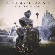
cool album art its like they took a picture of a desert and super-saturated it and then super-imposed
the silhouette of a daddy long legs spider that survived voldemorts avada kedavra spell onto the cover
very cool
|
| |
No band name
|
| |
Cool
|
| |
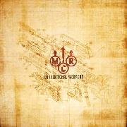
I liked the band logo it was distinctive
|
| |
Like the art. The titles are fairly annoying by themselves, but I liked Na (nananananananananananananananananana) so I think I'll like it once I hear it.
|
| |
looks like it took a lot of work to make
|
| |
it reminds me of that shitty album cover by The Bled but instead of shitty triangles it's a spider.
|
| |
Huh, kinda cool album art; a first for them. Doesn't seem to me like it fits their sound.
|
| |
their old album art style isn't fitting of all the Na's though...too black and solemn haha
|
| |
I like how they put most of them in parentheses, like they're supposed to be implied or something.
|
| |
i really like the album art, but i still think this is going to suck.
|
| |
Na Na Na (Na Na Na Na Na Na Na Na Na)
gettin jiggy wit it
turn the lights off; carry me home
Na Na Na (Na Na Na Na Na Na Na Na Na)
|
| |
Album name is stupid though. Cover actually looks like something a Rise Records band would put out.
|
| |
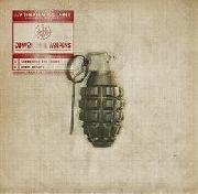
Album name is meh. Track titles are retarded. Album art is... well, it's just there.
|
| |
I think the artwork is a print Frank did. I could be wrong though
|
| |
better than their other ones
|
| |
so i take it that they wont use the old songs (death before disco etc.), stoked to say the least
|
| |
this will rule no matter what anyone says
|
| |
Na Na Na Na Na NA NA NA NA NA
sounds like a banana ad
http://www.youtube.com/watch?v=J03R_62la4g
|
| |
Between this and Underoath's "Ambiguation," my head will have exploded off my shoulder by the end of November.
|
| |
DESTROYA?
GODZILLA VS. DESTOROYAH!!!
|
| |
That looks so indie right there. Song titles sound like stuff from a regular punk band, let's hope they go with that :-)
|
| |
"Album name is stupid though. Cover actually looks like something a Rise Records band would put out."
My thoughts exactly. Kinda like this:
[img]http://girdermusic.com/store/images/thecolormorale.jpg[/img]
|
| |
Cool artwork. I'm surprised I've liked everything they've released for the album thus far.
|
| |
dave de sylvia are you single?
|
| |
Na na na na! Na na na na! Hey hey hey! Gooooodbye!
|
| |
Cool
|
| |
Hmmm. It's ok. I've definitely seen worse. But not great.
|
| |
Nice. I was expecting something similar to 'Three Cheers...'.
|
| |
now youre going to see this stupid spider on all the little kids everywhere.
ugh
|
| |
just disagree with everyone elses opinion
more fun
|
| |
gonna be siiiiick
|
| |
dissapointed after the awesome art for Three Cheers/Black parade
|
| |
stupid band.
|
| |
so is probot you fucktard
|
| |
I was expecting worse, and lazers.
|
| |
I like it 
|
| |
artwork would be cool without that shitty spider thing
|
| |
Ugh
|
| |
glad they've dropped all the dark imagery and stuff. Really looking forward to an MCR album for once
|
| |
MY HETEROSEXUAL BROMANCE!!!
|
| |
Album WILL rule
|
| |
lol, yeah. Good luck with that.
|
| |
It might...
|
| |
Keeping my fingers crossed for this. I already assumed this would be the album artwork, this print has been all over there pages.
|
| |
glad they've dropped all the dark imagery and stuff. Really looking forward to an MCR album for once
^agreed
|
| |


![http://girdermusic.com/store/images/thecolormorale.jpg[/img]](http://girdermusic.com/store/images/thecolormorale.jpg[/img])