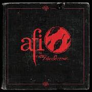
Cover is kinda lame
|
| |
No no, not lame, gay.
|
| |
really gay
|
| |
Well I didn't think that this one could be worse than the cover for Decemberunderground, but apparently I was wrong.
|
| |
zzzzzz
|
| |
nah it's not THAT bad guys. it's actually pretty cool
|
| |
but there are some 12 year-olds with MAD photoshop skillz man
plus it's ok that it doesn't fit with the rest of their covers. they're all pretty bland except for Black Sails.
|
| |
Haha
|
| |
I thought all of their album covers were great, this looks horrible. What the fuck happened to that revamped AFI logo of theirs? Honestly, this is miserable.
|
| |
whatever.
|
| |
I would have found this cool in my freshmen year of high school. now it just brings the lulz.
|
| |
I'm a junior and this is so damn lulzy, at least use the AFI logo and not some generic DRM-free text they downloaded from some site.
|
| |
needs less gold
http://i32.tinypic.com/65omfr.jpg see it looks ok like that well at least halfway to decent
|
| |
ugh
|
| |
I'm 16 and this is haha.
|
| |
I hope to god this is a joke.
|
| |
That's the gayest album cover I have ever seen. There's probably some secret message in it that makes it viable, but I can't be bothered to try to work it out. Typical emo-like cover.
|
| |
was just about to post that myself D :
|
| |
Only way this album cover could be cool is if the whole case were metallic.
|
| |
any news from this album is all pointing towards an absolute disaster
|
| |
uh oh
|
| |
What a load of bollocks.
|
| |
not toooooo bad......
|
| |
gay
|
| |
Cover looks fine- fitting for the prospective "commentary".
|
| |
Emo.
|
| |
it looks like the logo for like a lame 50's themed diner.
|
| |
lol can't wait to see it in stores
|
| |
i have given up any hope for this album
|
| |
cover is shit, and so will be this album.
|
| |
ew. if you only read what's scratched on the bottom, "run from us," it kind of seems like some ominous warning to stay clear of this album
|
| |
No no no no no no no...wow.
|
| |
Cut. Print. Gay.
|
| |
.. also, to add, it's AFI's eighth studio album.
|
| |
Dammit. What really bugs me is that they are an extremely creative band, and this is the best they come up with. I'm disappointed.
|
| |
just lame. ugly and lame
|
| |
I don't think this has actually been confirmed as the cover yet
|
| |
wow they leaked one of the gayest album covers ever... good job!
|
| |
I can't really add anything else that hasn't been said already, but that is one of the worst album covers ever.....for any band. I don't think the Backstreet Boys would use that.
|
| |
Yeah ever since The Art of Drowning, AFI hasn't exactly impressed with album art...
|
| |
So gay.
|
| |
Album will NOT rule.
|
| |
lol
|
| |
People still like AFI? Hmm...
|
| |
Who cares about the cover, music will still be awesome.
|
| |
you're in denial.
So was I, until I heard the clip. Trust me, this is going to suck.
|
| |
Hey this sucks they've had some good cover art before.
well hopefully the music still rocks
|
| |
This looks like a cover to a Mariah Carey album.
|
| |
This looks like a cover to a Mariah Carey album.
this
|
| |
It looks like the American Idol symbol. Shit on a stick.
|
| |
"oh hey, it's not even twisted with one metal piece. there's two!"
|
| |
lulz
|
| |
this better be a joke
|
| |
oh boy..........
|
| |
total shithouse compared to previous AFI covers.
|
| |
i dont think it's the cover. but we'll see. pretty...disappointing if it is. i hope its just a logo.
|
| |
lost all hope for this album ever since the freakin TITLE was announced. afi are gayer than ever
|
| |
i rekon it looks pretty cool, whats wrong with it? Kinda losing the punk look. But thats it
|
| |
whoa you must be the youngest person on sputnik!
|
| |
Nah bro I'm only 3.
|
| |
is it going to be an 80s glam rock album? looks like it plsu some joy division influences(the whole scratching names/slogans in wood)
|
| |
wtf is this garbage
|
| |


