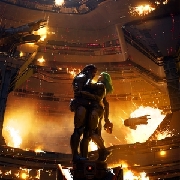
It looks sick.
|
| |
As I said in the deleted news article, this looks a lot better than the NWFT artwork, but it doesn't really matter as long as the music rules, which it probably will.
|
| |
I'm so stoked
|
| |
Great cover so that means it will rule.
Iksse3 and GA1 have the best covers and are the best imo.
|
| |
Cover seems suitably epic
|
| |
Cover really looks like it came from a Rise Records band, no kidding.
|
| |
Awesome cover... very excited for this.
|
| |
@bloc
No it would need colorful dinosaurs and trees for it to be a Rise Records release.
|
| |
Awesome.
|
| |
Pretty sweet, pretty excited
|
| |
I'm so stoked for this, really the first Coheed record I'm pumped for.
|
| |
perfect
|
| |
looks pretty generic and bad tbh
|
| |
Said this in the other article but I really like it, probably my favorite cover of theirs.
|
| |
between the buried and me?
oh no, it's a coheed album art
|
| |
Very IKS-esque with the cloud background. I definitely dig it.
|
| |
Yea totally excited for this. It's right up there with Fear through the eyes of maddness. Not the IV but the inside album art.
|
| |
And it almost looks like the opposite of "in keeping secrets of silent earth 3"
|
| |
I just came
|
| |
They need to just cut to it and release it. Don't think i can make it much longer. artwork is sick by the way.
|
| |
Pretty btbam-esque. I feel like im the only person who doesn't like this band.
|
| |
Album art looks amazing. The Roman numeral at the bottom is the cherry on the cake. Emphasizes that this is the beginning.
|
| |
dull ass cover.
album will prolly be alright tho.
|
| |
cover is so much better than their other shit.
|
| |
that cover sucks. I lost interest in this band after I realised Welcome Home was a one off
|
| |
artwork is awesome
|
| |
good apollo no world for tomorrow cover art is laughable
i like this one tho
|
| |
I lost interest in this band after I realised Welcome Home was a one off
LOL that song isn't even close to being their best.
|
| |
yeah it is yo
its epic as shit
|
| |
Nice!
|
| |