|
User
Reviews 29
Approval 97%
Soundoffs 31
News Articles 7
Band Edits + Tags 55
Album Edits 114
Album Ratings 969
Objectivity 91%
Last Active 04-07-18 8:10 am
Joined 01-06-15
Review Comments 315
| ArtBox's Art Box Week 11: Demon Hunter's Demons
Inspired by that one list with recurring cover motifs (or 0 creativity, as it was called), here's a completely 100% objective ranking of all of Demon Hunter's studio album artwork. Stop me if you've seen this one before. | | 8 | 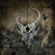 | Demon Hunter
Storm the Gates of Hell
I'm not feeling the cartographic look of this one. It's not terrible, but I think looking like a devil continent on the map of Hell doesn't feel as cool compared to the other designs. Could have been a cool concept, though. Now I really would like to see a map of Hell in the shape of a devil face. Make that your new fantasy world. | | 7 | 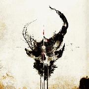 | Demon Hunter
Extremist
Again, not bad looking, but the "dripping black symbol on a deteriorating beige wall" look is really quite a cliche in the modern climate, and it suffers. We've had a surge in the demonic look though, so it was bound to happen anyway. | | 6 | 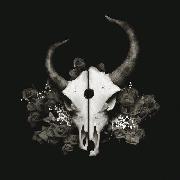 | Demon Hunter
Summer of Darkness
I do really like the bed of black roses that the skull rests in. It's a beautiful touch to what would have been a particularly bland and uninspired album cover. I just wish that was offset by a radiant flame or something, because Summer of Darkness certainly lives up to the "Darkness" of its name. It just doesn't live up to the "Summer." | | 5 |  | Demon Hunter
Demon Hunter
The OG Demon Hunter album cover. Am I giving it an advantage over Summer of Darkness because it has a dash of colour to it, despite its more detailed depiction of the horned beast? Yeah, and that's a bit biased. The "tome cover" look and hinges on the side look pretty nice too, like you're properly opening a book of the dead when you pop open the CD case. | | 4 |  | Demon Hunter
The Triptych
I think the halfway point of this list is where Demon Hunter get into their most beautiful covers, and we kick into gear with a Devil Kraken. It's got some really nice shading and ocean motifs - as well as that distortion of the main face itself, a bit of unpredictability. Overall quite pleasant to look at.
I mean, you're spoiled with this album, because it's got two alternative covers as well (almost like they all come together as a triptych wink wink nudge nudge). As it stands though, Devil Kraken is what we consider for the list. | | 3 | 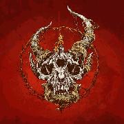 | Demon Hunter
True Defiance
Obviously what sets this apart from the other "literally all the same but not really" album covers of Demon Hunter is that you finally get a proper glimpse at what's haunting your CD collection. An old and withered skeleton, death incarnate, grinning in the way that skulls do, which is eternal, because they don't have any lips with which to cover up a grin. Even then, it needs that circle of thorns as a container of its true power. Hey, Demon Hunter are Christians, they know what they're doing.
Once again, this one comes with another two alternate covers, not as radical as the Triptych because they have the same facial design. They still look pretty cool though. Got a bit of a dreamcatcher element to them. | | 2 | 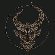 | Demon Hunter
Outlive
Much like OG Demon Hunter has you opening some tome, Outlive has you opening the Necronomicon itself. Honestly, I think the level of detail here is amazing, with just the amount of paths and twists the tendrils take, like it's an evil artifact being locked in by the book itself. If they have legitimate ridges and bumps and shit on the album cover, it'd be a dream come true. | | 1 | 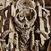 | Demon Hunter
The World Is a Thorn
Welcome to the Kingdom of Hell, bitches.
This is my favourite by a long shot. The tone of whatever stone that is, the way that everything fits together, the curvature of the architecture. With a little bit of editing you could have your very own MC Escher depiction of Lucifer's throne, and imagine if MC Escher had a depiction of Hell. You'd love it! So love this! It's pretty as shit, dude.
Gushing over. List over. | |
heck
11.18.16 | nothing on the alternate covers for 7 and 1? also I always thought 8's cover was supposed to be like rusty metal doors or something, not a map. the cover of the booklet even opens like a set of doors. | ArtBox
11.18.16 | Evidently I haven't done as much research as I should have :P Hadn't seen anything on alternate covers for 7 and 1. Should go take a look.
I can see the rusty metal doors thing now. A lot of this is quite first impression-y stuff, and that faded-out quality on the cover goes straight to "stained map" in my head, I guess. | TheTripP
11.18.16 | Love Demon Hunter, this is a nice list! Excited for Outlive have you seen the Vinyl cover for it? It's beast
http://media.virbcdn.com/cdn_images/resize_800x800/e9/6116180bc12bfe4d-dh_cover02.jpg |
|