|
User
Reviews 29
Approval 97%
Soundoffs 31
News Articles 7
Band Edits + Tags 55
Album Edits 116
Album Ratings 973
Objectivity 91%
Last Active 04-07-18 8:10 am
Joined 01-06-15
Review Comments 315
| ArtBox's Art Box Week 10: Fucking Puddle of Mudd
To celebrate having a somewhat decent work ethic in pumping out these cover-art-ranking lists, I decided to torture myself with Puddle of Mudd's kinda shitty cover art. It's a change of pace, hopefully less gushy than lists about bands I actually like and care about and think are relevant. Fucking Puddle of Mudd. Let's go. | | 5 | 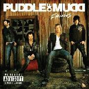 | Puddle of Mudd
Famous
What the fuck is this cover?
Why are you sitting on tyres and toolboxes? Why does the guy on the far right look like he wants to slip a little something something in my drink? Does the other nondescript black-shirting-wearing man know there's a photo being taken? Why did you pick a fucking meth lab to sit outside? Why do you all look so blatantly photoshopped and fake looking? Are you robots?
What the fuck is happening in this cover?
For fuck's sake. I just realised the Puddle of Mudd logo puts the Ds backwards in Mudd. | | 4 | 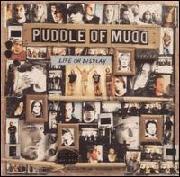 | Puddle of Mudd
Life On Display
Get it? It's a collage of the band members at various points of their lives, rendered so tiny that you don't know who it is and don't care, as long as the band can point and smugly chime in with a "It's our LIFE ON DISPLAY" and chuckle with a hillbilly inflection.
You'd think if they wanted to make a decent collage, they'd insert photos of them actually, you know, doing stuff. Not just promo shots of their faces at different levels of existential crises. | | 3 | 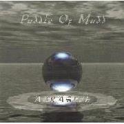 | Puddle of Mudd
Abrasive
I probably would have rated this higher if it looked a bit more polished. It's not a bad concept. However, since it's the late 90s...
As it stands, this looks like a shovelware Nintendo 64 marble racing game. That font is fucking disgusting as well. Also why would you make everything just different shades of grey, so nothing's readable and everything just sort of blends together? Were Puddle of Mudd the original Fifty Shades of Grey? Can you imagine Wes Scantlin as Christian Grey? Can we get off this fucking album cover please? | | 2 | 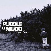 | Puddle of Mudd
Come Clean
Kurt Cobain put a naked kid on his Nevermind cover, yeah, but that kid was drowning in metaphorical poverty, trying to reach the money that would pull him out of his existence and capitalism, yeah yeah yeah, anger.
This is a kid pissing in a bush. What's the purpose of this kid? To piss in a bush, apparently. What does that have to do with coming clean? Nothing. Pissing doesn't really make you clean. You have to wash up afterwards, and this kid really doesn't have anything to wash up with. Why is he alone? Shit parenting, probably. I'm not being fair to Puddle of Mudd, but that's because they suck, and this sucks.
At least Puddle of Mudd get their damn colour palette right here. I mean, what's the point of being a commercial grunge band if your album covers are sunshine and rainbows? | | 1 | 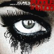 | Puddle of Mudd
Volume 4: Songs in the Key of Love and Hate
This goes at the top because it's a design that Puddle of Mudd would be able to fuck up the least.
Not sure where the "love" aspect comes in though. I mean, that eye looks pretty hate-filled, relevant to the key of hate. The monochromatic style also seems to accentuate that hate. Maybe "and Love" should be in brackets. It looks like Sin City, and Sin City did not have much love. Well, emotional loving, anyway.
Sin City did not also have its Ds backwards, motherfucking Puddle of Mudd. This list is done. Fucking Puddle of Mudd. | |
spookynewghostfriend
11.12.16 | For fuck's sake. I just realised the Puddle of Mudd logo puts the Ds backwards in Mudd.zzz
lel
You'd think if they wanted to make a decent collage, they'd insert photos of them actually, you know, doing stuff. Not just promo shots of their faces at different levels of existential crises.
mega lel
this looks like a shovelware Nintendo 64 marble racing game
ultra lel
| ArsMoriendi
11.17.16 | "I just realised the Puddle of Mudd logo puts the Ds backwards in Mud"
How Nine Inch Nails and Korn of them... |
|