|
User
Reviews 29
Approval 97%
Soundoffs 31
News Articles 7
Band Edits + Tags 55
Album Edits 116
Album Ratings 973
Objectivity 91%
Last Active 04-07-18 8:10 am
Joined 01-06-15
Review Comments 315
| Ranking The Strokes' Album Art (ArtBox's Art Box)
Week Three: We add a new crappy title in brackets. For this list, I'm counting the five studio albums and the Future Present Past EP. I'm also open for taking suggestions for other bodies of art to add my boring opinion to. | | 6 | 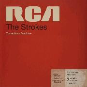 | The Strokes
Comedown Machine
Well, at least it tells you who made the album. I like the simplicity, and I know other reviewers on the site have pointed out the tongue-in-cheek placement of the record label - see Rudy K. and "The Last Record We Have To Make For RCA." Still, as much as I'm biased towards red, there's a lot more visual excitement in the other records. | | 5 | 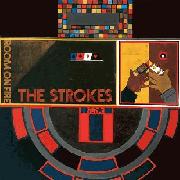 | The Strokes
Room on Fire
As I was writing about First Impressions - which was originally #5 - I tried to think about why I had put Room on Fire above it. At that point, I realised I didn't really connect with the artwork that much. It's aesthetically pleasing, and it is a painting by an actual artist if I remember correctly, but it all feels disjointed. Maybe sticking your name to established art may work in a different context, but it looks like there's two different forces at work here. The mosaic tone is intriguing though. I may have to find the actual artwork. | | 4 |  | The Strokes
First Impressions of Earth
Sure, the colour combination is pretty standard, but I think the cover fits to the album. It makes you feel like you're the alien, flying at mach speed through the warp, not know how far the light at the end of the tunnel is but enjoying the journey, if if it's a little bumpy. The Strokes may not be the final frontier, but uncharted territory is a good enough consolation. | | 3 | 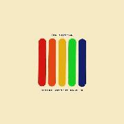 | The Strokes
Future Present Past
What separates the minimalism of First Impressions from this? Firstly, there's the blatant pandering to the concept (contrasting the title going backwards with the rainbow going forward, five members and five stripes, yada yada yada). The fact that there's a more interesting colour palette, with the metaphorical band being all kinds of interesting in a sea of beige. Maybe it's the fact that the future, the past and the present all seems so small though, as if a rainbow could be so existential. Maybe I'm reading way too much into it. Definitely reading way too much into it. But that's the fun of it. | | 2 |  | The Strokes
Angles
Optical illusions, far as the eye can see. You don't know what to expect. It plays tricks on you. It's all about angles, to make a very ham-fisted attempt at jamming the album's title into my analysis. I don't really have much to say about this one, to my surprise. It's a bright yellow, as if the sun were shining on The Strokes for the first time in a long time. It may also be just another illusion. Who knows? | | 1 | 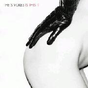 | The Strokes
Is This It
I know what you're thinking. "God damn it, ArtBox, even in a fucking art list you've fallen prey to the Is This It circlejerk." Yeah, probably. But it's sexy without getting too far out there, there's a hint of danger in the leather, it's stylistic, and most importantly, it all looks effortless. It's why I've put it at #1, it's why it still holds up and it's why everyone fell in love with The Strokes in the first place.
Well, unless you had that pretty average alternative cover. That probably ruined the image a little bit. | |
elliootsmeuth
09.21.16 | 1>5>3>4>6>3 for me | Clumseee
09.21.16 | 3>6>1>4>2>5.
RCA thing aside, I like the shade of red and the font choice and alllll that. So it's le cool. | guitarded_chuck
09.21.16 | ass >
agreed |
|