|
User
Reviews 29
Approval 97%
Soundoffs 31
News Articles 7
Band Edits + Tags 55
Album Edits 116
Album Ratings 971
Objectivity 91%
Last Active 04-07-18 8:10 am
Joined 01-06-15
Review Comments 315
| Ranking Deftones' Album Artwork
As I finally started catching up to everyone - only a few years late - with my Deftones CD collection, I realised "Hey, these album covers are nice as shit." Thought it'd make a decent list to rank them. | | 8 | 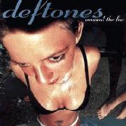 | Deftones
Around the Fur
Wet cleavage does not a good album artwork make. | | 7 |  | Deftones
White Pony
And here we have the minimalism. The placement of the white pony is nice, but it doesn't change the fact that 90% is a grey slab. Still, not bad for a "You'd Prefer An Astronaut" alternative cover. | | 6 | 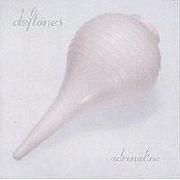 | Deftones
Adrenaline
How the font and the faded look manages to make an enema syringe look classy, I have no idea. But there you go. It's a posh enema syringe. | | 5 | 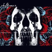 | Deftones
Deftones
I could have done with a less dominant skull, but Deftones is dominance, I guess. The juxtaposition of the colour palette is absolutely gorgeous though, and the letterbox effect - almost Cinemascope. It saves it from being any lower. | | 4 | 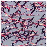 | Deftones
Gore
This artwork pretty much sums up Deftones when you first listen: There's a beautiful blend of the colourful, the almost serene, and the flurry of furious chaos. I'm also sure the ranking of this artwork is absolutely going to be hated by some users. | | 3 | 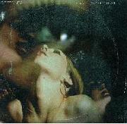 | Deftones
Saturday Night Wrist
If some random Internet forum is to be believed, this is a layering of stills from some softcore stuff. Then again, it's a random Internet forum. In any case, it's an absolutely beautiful layering. The neck rises just enough to instill an uncanny valley effect, and I adore the washed-out green look spreading between the overlooking eye and all the faces. There's so much fantastic imagery on the surface you want to see what's underneath - just like softcore, I guess. | | 2 |  | Deftones
Diamond Eyes
The minimalism is back, but it's also back in your face. You're just drawn towards the barn owl's eyes, almost dead but with a glimmer of steel and calculation. You're considered with cold, ruthless indifference, and the power sucks you in, closer, close enough to see the details of each feather, a new detail every time. | | 1 | 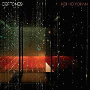 | Deftones
Koi No Yokan
Really I'm just mesmerised by everything in this. The red and green hues, how the sparkles make a whole galaxy appear in the few sheets of whatever that is (glass, I guess) - I love looking at it. It looks like a pocket devoid of any contact with the universe around it, pristine. | |
spookynewghostfriend
09.10.16 | jah aggggggreeeedddddddd | AlexKzillion
09.10.16 | 1>8>3>rest | TedSchmosby
09.10.16 | Top 3 is definitely top 3. There was a time when I thought the s/t artwork was terrible and belonged on a Wal-Mart shirt but I quite like it now | Flugmorph
09.10.16 | good writeups. i think 3 is my fav | elliootsmeuth
09.10.16 | "Still, not bad for a "You'd Prefer An Astronaut" alternative cover."
I have always thought that lmao | elliootsmeuth
09.10.16 | Yeah, good write ups. Totally see where you'er coming from on all these and pretty much agree with everything. | FullOfSounds
09.10.16 | 1 is 1 yay. | LotusFlower
09.10.16 | "Wet cleavage does not a good album artwork make."
in your opinion. | FullOfSounds
09.10.16 | oh boy | LotusFlower
09.10.16 | i know ._. | AlexKzillion
09.10.16 | Around the Fur cover is great. | Futures
09.10.16 | 8 is like 3rd best hard | AlexKzillion
09.10.16 | Can't think of an album cover that better represents an album's sound off the top of my head right now. | dbizzles
09.10.16 | Always loved 5 best. Don't know why. When I think Deftones, I think 5. | wwf
09.10.16 | 5 is maximum edgy, always hated that cover tbh. The angle of the camera in 8 always made it one of my favorites, it's more than just a sexy picture imo. I didn't like 1's album art when they first showed it off but when I got it on cd I liked it a lot more. But yeah good writeups | porcupinetheater
09.10.16 | 7 is way too low, minimalism is fantastic. + 6, 5, and 4 are ugly as hell | wwf
09.10.16 | I like 7 more than 5 and 6 but that grey is really heinous tbhtbh | AlexKzillion
09.10.16 | The AtF cover is obviously supposed to be sexual and stuff but there is also kind of a danger to it with that dude's leg in the back plus the girl looks drugged and the camera angle elevates all of these traits and adds a weary effect to it. SNW took it a step further. Much cleaner, dreamier, and "mature" looking but still keeps the eeriness from the atf cover. Think that is a good comparison between the actual albums too and I'm pretty sure I've said all of this before in some other Deftones thread lol@me. | porcupinetheater
09.10.16 | And to think the cover came about just because they had to crop the photo so Frank's ex wife wouldn't divorce him for being with the girl in the hot tub | wwf
09.10.16 | I don't get as much of an unsettling voyeuristic feel from SNW, it just kinda looks like a weird psychedelic cover to me with no real structure to it | porcupinetheater
09.10.16 | Even with the big ass eyeball underscoring the image? | FullOfSounds
09.10.16 | Now that I think about it, 2 might be my fav. The owl is so damn pretty. | FullOfSounds
09.10.16 | Especially in the Diamond Eyes music video. | dbizzles
09.10.16 | '5 is maximum edgy'
The fuck is edgy about a skull? That's, like, the least edgy thing you could use. | wwf
09.10.16 | idk, I've never seen it in person iirc so maybe it just doesn't translate online well.
it looks cleaner here than anywhere else I've seen it http://www.rock.com/assets/products/376627/large/deftones-saturday-night-wrist-vinyl-lp-16279599-mav43239.jpg
and speaking of not translating well online
'The fuck is edgy about a skull? That's, like, the least edgy thing you could use.'
you're being sarcastic right | dbizzles
09.10.16 | No, man. Gore cover is way more edgy, imo. | dbizzles
09.10.16 | I mean, I thought skulls were pretty edgy when I was in 6th grade. | AlexKzillion
09.10.16 | All their album covers look much clearer on vinyl, especially Adrenaline, AtF and SNW. | HazelMotes92
09.10.16 | 1 and 2 are decent, 4 and 7 are passable, 8 actually might be my favorite (wwf and MrAlexK are spot on about it).
Deftones' sound and themes to me are largely about the intersection of violence/danger and sexuality, and AtF cover captures this really well. | oltnabrick
09.10.16 | 4 & 7 r my favs | Middle18
09.10.16 | An actual original deftones list for once, And what great album covers they have, i like them all in their own way. Shout out to (like) linus with the cool cat. | Valkoor952
09.10.16 | 1 and 3 all the way. My least favourite is ATF though. | ArtBox
09.12.16 | I will concede and say if we were considering White Pony's re-release cover, all white with the gigantic pony outline, I probably would've placed it a lot higher on the list. I'm not feeling the grey too much though.
Glad to see this got a good discussion. | DoofusWainwright
09.14.16 | All these are pretty bad, 1 is attractive but it doesn't convey the style of the band | onionbubs
09.14.16 | always liked 1 and 3. i also like 5, mostly because of the color scheme. |
|