Longtime keyboard player and guitarist have amicably departed from the band; an end to an era. However, band doesn't know how to put out bad music, so everything is going to work just as fine, I reckon.
|
| |
Sad to see them go, as I was when Kristoffer and Johan departed previously. There has been a dip in quality,
but I'm always looking forward to anything by the band, hopefully they'll release a new album next year. The
songs on this album are guaranteed to be re-arranged and interesting.
|
| |
And as other prog legends would say, AND YET IT MOVES!Finally, after three years of silence, PoS are back and slowly start writing material again. Hopefully I'll get to see them next year or the one after that.
|
| |
@OmairSh Well, apart from Scarsick, I can't find any album that is just ''good''. Their last two LP's, Road Salt I & II are both excellent. At first I couldn't get into RS II but when it hit me, it hit me hard.
|
| |
I humbly beg to differ, I don't really see a dip in quality, the band just changed style, for the better if you are asking me.
|
| |
I could never properly get into RS 1, the second is better and was easier to digest but I still felt it
could have been better. Hoping they change their sound for the next album (almost sure that they will).
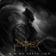
This album is the first to brandish the new logo, though they pretty much change the logo on every album so
not sure if its permanent
|
| |
Yeah, the style will change, but I don't think POS will ever return to progressive metal, given that they never made the same album twice.
|
| |
Well Remedy Lane was also prog metal, but it wasn't the same as TPE, the same goes for Scarsick. Prog metal doesn't have to be as narrow minded as the majority of the bands make it
|
| |
@Omairsh It's funny how I could easily and quickly digest RS I and love it instantly and didn't like much RS II, and you are going the other way around. (yeah, ''funny'', not funny ''haha'', but you get my point......)
New logo is interesting, but cannot be compared to the Remedy Lane one.
|
| |
Well that's the beauty of music right, very subjective. You liked the RL logo? I've actually never
considered any of their previous logos as proper logos tbh except the RS one since a few bands were going
for logos based on standard fonts. This new one is cool but I don't know why it feels like somethings
missing. New listeners could confuse them for a christian rock band with that cross shaped t :P
|
| |
It's actually a simple one with bland letters and without any shade or anything, that's why you have that impression. But christian rock? That would be interesting.
|
| |
Looking forward to this. If Daniel still writes acoustic versions as well as he did on 12:5, this is going to be great stuff.
|
| |
Thats what I'm thinking
|
| |