Album Art Gallery Part 4: 1972
I've always loved album artworks. I see them as its own art form, separate (though sometimes related) to the music contained within them. So even if many album cover lists exist already in Sputnik, I wanted to start my own series showcasing the ones that caught my attention, wether it is because I think they are beautiful as works of art, interesting in concept or simply because I think they look "cool" regardless of a deeper value. This is part 4 and, as always, recs are welcomed |
| 1 |  | Blue Oyster Cult
Blue Öyster Cult
I love this one. Surreal, enigmatic and eerie, with an ominous feeling to it. It checks almost all of my boxes |
| 2 |  | Cymande
Cymande |
| 3 |  | The Allman Brothers Band
Eat a Peach
It's a peach! :D. I also like pink/baby blue coloring |
| 4 |  | Dr. John
Dr. John's Gumbo |
| 5 |  | Lo Borges
Lo Borges
Both Lo Borges and Clube da Esquina do a nice work at showcasing in a straightforward yet iconic way the message behind the music of said albums: The brazilian people |
| 6 |  | Milton Nascimento and Lo Borges
Clube da Esquina |
| 7 |  | Todd Rundgren
Something/Anything? |
| 8 |  | Gentle Giant
Octopus |
| 9 |  | Gentle Giant
Three Friends |
| 10 |  | JW Farquhar
The Formal Female
Beautiful one. The colors and landscape produce a soothing feeling that gets immediatly twisted by that amorphous figure (a great take on the album's title). A great case of surreal artwork and why I love them |
| 11 |  | Little Feat
Sailin' Shoes
A goofy looking swinging cake and a snail. Mick Jagger is also in there, because why not |
| 12 |  | Khan
Space Shanty |
| 13 |  | Mom's Apple Pie
Mom's Apple Pie
Perfectly executed innuendo |
| 14 |  | The Rolling Stones
Exile on Main St. |
| 15 |  | Neu!
Neu!
This has been done a thousand times. It's almost an effortless attempt at an album cover, yet why is it that in this case it feels that it really achieves a quintessential status? Perhaps it is the exclamation mark? Maybe the fact that "Neu" is a really easy word to remember? In the end, the most surprising thing of all is that they achieved this a second time with Neu! 75, even if that would've been seen a second attempt at lazyness if any other band had done it |
| 16 |  | Malo
Malo |
| 17 |  | Czeslaw Niemen
Vol. 1 |
| 18 |  | Audience
Lunch
It certainly achieves the idea of a mundane, almost cookie-cutter image with its portray of 50's housewives. The same can be said about Fumble |
| 19 |  | Fumble
Fumble |
| 20 |  | Black Widow
III
I don't know if it actually tries to portray an image of dementia or something similar but that's what it achieves for me |
| 21 |  | Dust
Hard Attack |
| 22 |  | Frank Zappa
Waka/Jawaka |
| 23 |  | Gnidrolog
Lady Lake
While it follows a style that would become a little bit too common on decades to come (specially for power metal bands). I think Lady Lake executes the concept pretty well. It is an excellent painting |
| 24 |  | Genesis
Foxtrot |
| 25 |  | Nektar
A Tab in the Ocean |
| 26 |  | Oregon
Music Of Another Present Era
The colors in this one are really cool |
| 27 |  | Ornette Coleman
Science Fiction
There is something mysteryous and ominous about this one that I really dig |
| 28 |  | Return to Forever
Return to Forever
Fantastic shot and composition. Its simplicity adds to a feeling of freedom and liberation. |
| 29 |  | Premiata Forneria Marconi
Storia di un minuto |
| 30 |  | Premiata Forneria Marconi
Per un amico |
| 31 |  | Wendy Carlos
Walter Carlos' Clockwork Orange |
| 32 |  | Mal Waldron And Terumasa Hino
Reminicent Suite
This one achieves the same effect as Return to Forever's debut for me, but the unnatural green color and the fact that it is hundreds of birds instead of just one, give a different scale to the concept, one in which liberation almost feels rupturist and menacing |
| 33 |  | Uriah Heep
Demons and Wizards |
| 34 | 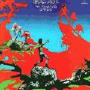 | Uriah Heep
The Magician's Birthday |
| 35 |  | Frank Zappa
The Grand Wazoo
Lots of details to enjoy on this "musical war" |
| 36 |  | Jethro Tull
Thick as a Brick
I'm not sure if Thick as a Brick was the first "newspaper like album cover", I doubt it, but in any case as I've said on previous parts, it is always cool when you can get lost reading/looking at the details in an LP cover |
| 37 |  | Herbie Hancock
Crossings |
| 38 |  | Cargo
Cargo
Simple and quite literal. A good example of a "normal" photo that works well as an album cover |
| 39 |  | Can
Ege Bamyasi
A timeless one. Instantly recognizable and iconic |
| 40 |  | McLuhan
Anomaly |
| 41 |  | Quella Vecchia Locanda
Quella vecchia locanda
Perfect mix of cold and warm |
| 42 |  | Roxy Music
Roxy Music |
| 43 |  | Jerusalem (UK)
Jerusalem
The unadorned brushwork mixed with the almost two-dimensional looking yet striking and dramatic pose make for a very epic artwork that will stay in your head |
| 44 |  | Haikara
Haikara
Gives me a feeling similar to that of Formal Female but in a much more "in your face" way |
| 45 |  | Duke Ellington
Latin American Suite
Great composition |
| 46 |  | Flash
Flash |
| 47 |  | Pink Floyd
Obscured by Clouds |
| 48 |  | String Driven Thing
String Driven Thing |
| 49 |  | Budgie
Squawk
Probably my favorite Budgie artwork. It has a simple yet well executed composition and the end result of the fighter jet/bird skull mish mash is actually pretty cool looking |
| 50 |  | Mythos (GER)
Mythos |
| 51 |  | Le Orme
Uomo di pezza
Reminds me of a great mix between european styles of the first half of the XX century and that classic Fernando Botero vibe |
| 52 |  | Kevin Ayers
Whatevershebringswesing |
| 53 |  | Renaissance
Prologue
One of those cases in which I'm not sure what Hipgnosis tried to achieve, but it certainly looks stylish. It looks uncanny and alien like many of my favorites by them |
| 54 |  | Santana
Caravanserai |
| 55 |  | Twenty Sixty Six and Then
Reflections! |
| 56 |  | War (USA)
The World Is a Ghetto
Many details, eyecatching, instantly classic and a good representation of the album's message. Everything about this one's great |
| 57 |  | Weather Report
I Sing The Body Electric |
| 58 |  | Moving Gelatine Plates
The World of Genius Hans
I think this is where the idea for NoMeansNo's Wrong might have come from. While the animal headed "thing" looks better in this one, I'd say the black and white effect for Wrong works better |
| 59 |  | Jerry Garcia
Garcia |
| 60 |  | Luiz Bonfa
Introspection |
| 61 |  | Grobschnitt
Grobschnitt
I think this one would've benefited from a frameless approach but it still looks awesome |
| 62 |  | Sounds of Liberation
Sounds of Liberation |
| 63 |  | Pescado Rabioso
Desatormentandonos
Chaotic, with tinges of both biological and mechanical concepts. It looks awesome |
| 64 |  | Jane (DE)
Together |
| 65 |  | Monty Python
Monty Python's Previous Record |
| 66 |  | The Edgar Winter Group
They Only Come Out At Night
Not really a "pretty" cover, but I find some kind of corny magic to it |
| 67 |  | The Nice
Autumn '67 - Spring '68 |
| 68 |  | Tangerine Dream
Zeit
I'm not sure if it is a painting or a real picture of a solar eclipse. In any case it is one of the better depictions of one I've seen. The solar waves and the mix of orange and blue are fantastic |
| 69 | 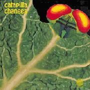 | Catapilla
Changes
LP sleeves with weird shapes are always cool and this one feels pretty ingenious |
| 70 |  | McCoy Tyner
Sahara |
| 71 |  | Franco Battiato
Pollution
A simple and creative way to reflect the album's title |
| 72 |  | Mellow Candle
Swaddling Songs |
| 73 |  | Marcos Valle
Vento Sul |
| 74 |  | Terry Callier
What Color is Love?
It conveys the message/vibe of the album pretty well: Intimacy and cotidianity |
| 75 |  | Wishbone Ash
Argus
An instantly identifiable, ageless image that has become synonym with Wishbone Ash and their sound |
|