Best and worst album covers of 2018
First 10 are worst, second 10 are best. Limited to albums I actually listened to (so no 6ix9nine shit). |
| 1 | 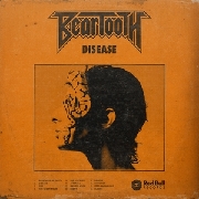 | Beartooth
Disease
WORST #10: Beartooth - Disease.
That faded orange colour looks absolutely disgusting (get it?!?!?!) and the band logo is very unappealing. On top of that, the snake-face thing looks more like a woman with some kind of infection you'd see in a terrible zombie film. |
| 2 | 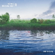 | New Deadline
To Hope
WORST #9: New Deadline - To Hope.
The album's alright, but there is just something so... off about the cover art. I think it's the fact that it shows some water with trees, yet feels incredibly unnatural. The colours don't match what's displayed and it makes me somewhat uncomfortable. |
| 3 |  | Milestones
Red Lights
WORST #8: Milestones - Red Lights.
Get it? The record is called Red Lights.. and it has like.. red lights on the cover. That's pretty fucking tight. |
| 4 | 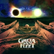 | Greta Van Fleet
Anthem of the Peaceful Army
WORST #7: Greta Van Fleet - Anthem of the Peaceful Army.
This album art is truly incredibly. They somehow went wrong in spite of including a starry sky on the cover, because, let's be real, starry skies make almost everything look good. The same problem as with New Deadline's cover applies here, plus the fucking annoying semi-symmetry. The rocks are mostly symmetrical but that goddamn sun just kind of does whatever it wants. Ugh. |
| 5 |  | Nothing
Dance On The Blacktop
WORST #6: Nothing - Dance On The Blacktop
Why? How is this representative of the music in any way? Who came up with this? Who would want this on vinyl so they could stare at that.. creature all day long? |
| 6 | 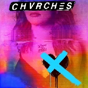 | CHVRCHES
Love Is Dead
WORST #5: Chvrches - Love Is Dead
This album art establishes a few things: 1) Lauren is the only Chvrches member, 2) they make really COLOURFUL music haha!! but 3) it still has an edge to it, did you see that black, crossed out heart???? :/ |
| 7 | 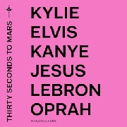 | Thirty Seconds to Mars
America
WORST #4: Thirty Seconds to Mars - America
These covers are obviously garbage, but its biggest offense is that it didn't even make for a good meme. Like, come on, there was so much meme potential here. |
| 8 |  | Five Finger Death Punch
And Justice for None
WORST #3: Five Finger Death Punch - And Justice For None
I managed to slice through a metal pole with this cover. |
| 9 | 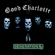 | Good Charlotte
Generation Rx
WORST #2: Good Charlotte - Generation Rx
OOOOOh fuuck dude they're like skeletons to symbolise how dark this album is but you probably don't get that because it's just too deep for you like bro do you even understand all the pain mr Madden feels oof dude |
| 10 | 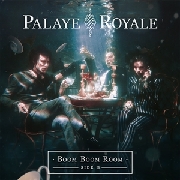 | Palaye Royale
Boom Boom Room (Side B)
WORST #1: Palaye Royale - Boom Boom Room (Side B)
According to the guitarist/generally awful guy of this band, the artworks captured their thoughts: “As kids we were too stubborn to come up for air now forever lost boys floating around - in need of nothing besides one another.”. Fuck knows what that means. The only thoughts I can see captured here are something along the lines of 'our band is called Palaye Royale and this album is called 'Boom Boom Room Side B', how the hell do we manage that level of fucking stupidity visually?'. In my opinion, they succeeded. |
| 11 |  | Slow Crush
Aurora
BEST #10: Slow Crush - Aurora
Besides the fact that the colour scheme here is gorgeous, I love the fact that it seems to be such a simplistic situation with so much going on. Without getting too overly pretentious, it shows how something as simplistic as a puddle can capture a whole lot (of beauty). |
| 12 | 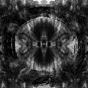 | Architects
Holy Hell
BEST #9: Architects - Holy Hell
I love how this cover art captures a sense of organised chaos, much like the band's music. While there is a lot to see and every corner shows a lot of intricate detail, the full picture also displays symmetry and a clear pattern. Besides that, it's difficult to go wrong with black and white album art that brings religious imagery to mind. |
| 13 | 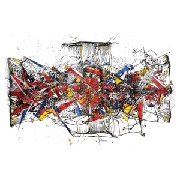 | mewithoutYou
[Untitled]
BEST #8: mewithoutYou - [Untitled]
Another cover that captures the album's music perfectly, [Untitled]'s cover looks like an explosion of colours that all seem to fall perfectly in place. Yet again, the organised chaos makes for a rather intriguing piece of album art. |
| 14 | 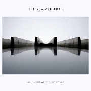 | The Summer Kills
Last Night We Became Swans
BEST #7: The Summer Kills - Last Night We Became Swans
Symmetry in photography, a simplistic font and minimalism that is a bit more intricate than three dots on a white image is everything I like. This cover falls into the somewhat vague category of 'extremely aesthetically pleasing'. |
| 15 | 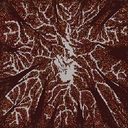 | Trash Boat
Crown Shyness
BEST #6: Trash Boat - Crown Shyness
Sure, it's a bit tongue-in-cheek with the cover showing exactly what the album title suggests, but the concept of crown shyness is unique and beautiful enough for that to be forgiven, On top of that, the trees shape the band's logo Iwhich might have taken me three months to realise) which adds an extra dimension to an already very pretty cover. |
| 16 | 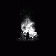 | Typhoon (USA-OR)
Offerings
BEST #5: Typhoon - Offerings
I love how many connotations this image has. Darkness, light in this darkness, mystique; words that could also be used to sum up the album's music. The fact that the image is in black and white only makes it better, mostly because I am one of those idiots who think everything looks better in black and white, #edge. |
| 17 | 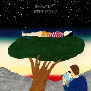 | Basement
Beside Myself
BEST #4: Basement - Beside Myself
Seems like I'm really into starry nights and women lying on broccoli. |
| 18 | 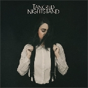 | Tancred
Nightstand
BEST #3: Tancred - Nightstand
I rarely like album covers that feature the artist; they're usually either tacky, obnoxious or just plain ugly. Thankfully Nightstand is none of those things, with its simplistic colour scheme making Jess seemingly blend into the black background. Besides that, the obvious Patti Smith reference and her distant feel due to hair partially covering her face and her gaze fixated to the ground make it a very pretty image. |
| 19 | 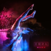 | Erra
Neon
BEST #2: Erra - Neon
THOSE COLOURS GODDAMN |
| 20 | 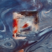 | Black Peaks
All That Divides
BEST #1: Black Peaks - All That Divides
Yeah alright I've been trying to explain why I love this album art so much for a while now, but I can't. It's just really fucking beautiful, look at it. |
|
