JamieTwort
09.09.13 | Trying to fix the album art for 1, as the image uploaded on here is of terrible quality. |
ButteryBiscuitBass
09.09.13 | Tremendous list, bro. I'm a big fan of the Yes artwork for Relayer, Tales, CTTE and Fragile. |
MrElmo
09.09.13 | "I've often considered album artwork to be a lot more than just the packaging of an album. For me a well thought out album cover can shape the feel of an album and complement the music within."
This hard |
MrElmo
09.09.13 | List is also really good and enteresting |
JamieTwort
09.09.13 | Thanks Buttery. Oh yeah I was actually considering including some Yes artwork, not sure why I didn't in the end. I particularly like the artwork inside (the gatefold) of Close to the Edge.
Thanks Elmo. |
Smial
09.09.13 | i often prejudge the quality of the album based on the artwork |
evilford
09.09.13 | I love you |
evilford
09.09.13 | totally agree with you Jamie, album art is something I definitely enjoy a lot and it really can enhance the album.
requested feature btw |
JamieTwort
09.09.13 | "i often prejudge the quality of the album based on the artwork"
Sometimes my preference for a particular album's artwork helps me decide which album to check out for a particular band/artist if I'm choosing between multiple albums. I wouldn't say I often prejudge an album on its artwork though.
Haha, love you too ford. And thanks dude. |
MrElmo
09.09.13 | Good artwork does help to decide what album to start with but what happens to bands like the residents with consistently
terrible artwork? |
MrElmo
09.09.13 | Apart from Duck Stab wich is probably why it's the most listened album in their discog |
JamieTwort
09.09.13 | I said sometimes dude. I only do that if one album has artwork that particularly appeals to me. |
Smial
09.09.13 | well ill still go in and listen to it, and completely disregard the album art while doing so. but im just like you yeah certain art goes with certain music and it feels better when it does. but my rating isnt remotely determined by the art |
MrElmo
09.09.13 | Yeah I get what you mean I'll do that too, it even got me to discover Converge's You Fail Me wich became my favorite
'verge and made me get into the band (still one of my favorite artworks) |
JamieTwort
09.09.13 | "well ill still go in and listen to it, and completely disregard the album art while doing so. but im just like you yeah certain art goes with certain music and it feels better when it does."
Oh right, yeah agreed. |
mindleviticus
09.09.13 | marc leclair - musique pour trois femmes enceintes
//that's an awesome album cover |
JamieTwort
09.09.13 | ^Great cover indeed. I'm gonna have to listen to that now. |
mindleviticus
09.09.13 | poor little lonely basketball net :[ |
manosg
09.09.13 | Your list description says it all. I think that even some may say that they're not influenced by cover art it does influence all of us on a subliminal level. I also see that you go for photographs more than graphics. |
JamieTwort
09.09.13 | "I also see that you go for photographs more than graphics."
Yeah I do, that would be because I'm a photographer. |
manosg
09.09.13 | haha, pretty good reason. I tend to go more towards fictional creations. For example, Savatage - Gutter Ballet is one of the album covers I love.
Also, I think you'll like the cover art of The Gathering - Nighttime Birds. |
Keyblade
09.09.13 | First 7 albums on the list...lawd help me |
JamieTwort
09.09.13 | @manosg: I do like the kind of artwork too, it just doesn't appeal to me quite as much. And yeah that Gathering cover is an interesting one.
"First 7 albums on the list...lawd help me"
Haha, knew you'd appreciate that section of the list. |
Keyblade
09.09.13 | Lol nice list man |
JamieTwort
09.09.13 | Thanks bro. |
greg84
09.09.13 | Featured. Tada. |
JamieTwort
09.09.13 | Thanks Greg. |
ButteryBiscuitBass
09.09.13 | Grats on the feature, ugly. |
JamieTwort
09.09.13 | Thanks, dick head. |
demigod!
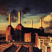
09.09.13 | album art is very important for me; it basically depicts what kind of imagery / shades i'll be seeing in my head while jamming the LP. for example, Animals i always depict a brown, dark, cloudy and industrial cityscape at dusk, while an album like Morningrise I pretty much get transported to a cold part of the countrylands of Sweden(? I assume that's where the picture was taken) during, well the morning rise... Hell, what I'd rate an album usually goes hand in hand with what i'd rate it's cover art. If I'd ever do such a thing. |
ButteryBiscuitBass
09.09.13 | :D |
JS19
09.09.13 | Props on 2, I'm not sure why that album never got much love. I downloaded it simply on the artwork,
and it's perfect for the music. I think you're right about ambient music and album covers. Sometimes a
bad cover can ruin a fantastic ambient album because it just creates the wrong mood. |
JamieTwort
09.09.13 | @demi:
"while an album like Morningrise I pretty much get transported to a cold part of the countrylands of Sweden(? I assume that's where the picture was taken)"
It was actually taken in England believe it or not.
And yes I agree with most of what you said, especially about Animals. |
JamieTwort
09.09.13 | @JS19: 2 is actually one of my all time favourite ambient albums. |
JS19
09.09.13 | It's definitely one of my better ones, how is their newest? Haven't got that one yet. I don't actually have 1 yet either but I always found Eluvium a bit underwhelming |
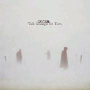
JamieTwort
09.09.13 | Their new album is really good, I like it almost as much as Sorcery/Geography (I can see myself liking it even more given time). It's one of my favourite albums of the year so far. As for Eluvium, I actually found Copia a bit underwhelming but Talk Amongst the Trees is up there with my favourite ambient so definitely check it out. Even if you weren't too keen on the Eluvium albums you've heard so far you might still like it. |
JS19
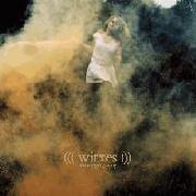
09.09.13 | Awesome, cheers. I was never that keen on Copia either but Nightmare Ending has some amazing pieces on it so I will definitely check at some point. That and definitely that new Witxes |
Atari
09.09.13 | really cool list bro |
reportingbird
09.09.13 | list rules.don't forget the artwork for the antlers-hospice.
|
MrSirLordGentleman
09.09.13 | Needs more Hipgnosis hehe, but great list Jamie, very detailed |
RogueNine
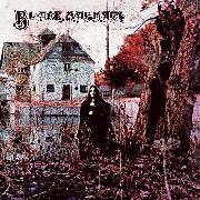
09.09.13 | 18 may be my favorite Floyd artwork; that or Dark Side. |
JamieTwort
09.09.13 | Thanks guys. |
JamieTwort
09.09.13 | @Rogue: Good to see someone else who rates that album's art so highly. Animals will always be my favourite Floyd album cover though. |
Havey
09.09.13 | the glow pt 2 |
JamieTwort
09.09.13 | Yeah that's a pretty good one. There's a couple of Mount Eerie album covers that would fit the bill too. |
mindleviticus
09.09.13 | album artwork is probably the most important thing in music :] |
ShitsofRain
09.09.13 | No Loveless?
agreed mindle |
JamieTwort
09.09.13 | Nah but that is a pretty sweet cover. Like I said in the description this isn't a definitive top 20 or anything. |
TheSpaceMan
09.09.13 | cool list, especially agree with Innerspeaker... thats one of the closest representations of a acid trip ive ever seen
I have Thick as a Brick on vinyl and its got a satical newspaper article about the "poem" the albums based off of. its so tongue and cheek its perfect for the concept |
Millstone
09.09.13 | No OK Computer? Damn. |
JamieTwort
09.09.13 | Thanks SpaceMan. Yeah that's one of the things I love most about Thick as a Brick's artwork. |
TheSpaceMan
09.09.13 | wow I really have to say man props on this list, one of the best I've seen in a while. you put a lot of time into it and it paid of for a very enjoyable read (just read through em all). What Demi said earlier about artwork's impact on the album is so true, to the point where I admit I've been biased and even refused to listen to some albums for awhile because the cover art is terrible (*cough* QOTSA *cough*) |
JamieTwort
09.09.13 | Thanks dude, glad you enjoyed reading it. |
Millstone
09.09.13 | Yeah, QotSA's album covers are fucking lazy. |
TheSpaceMan
09.09.13 | @ Millstone like if Songs for the Deaf had an image of a truck's dashboard with the radio on and a long desert highway stretching out the windshield, I'd be a much happier man
@Jamie no problem, credit is given where it is due
|
JamieTwort
09.09.13 | Yeah QOTSA's album covers are pretty boring for the most part. Kyuss' albums covers were much better. |
TheSpaceMan
09.09.13 | the songs on Welcome to Sky Valley were written based off the picture, I swear |
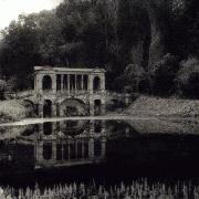
VisionsFromTheDarkSide
09.09.13 | #10 is beautiful, I've always wanted to get there, hopefully I'll get the chance soon |
JamieTwort
09.09.13 | I hope to go there one day too. |
Judio!
09.09.13 | Have you ever seen Amon Amarth's album art? It's cool as fuck. |
JamieTwort
09.09.13 | Yeah I have. That style of artwork doesn't really appeal to me much but it's pretty sweet for what it is. |
MO
09.09.13 | wicked list as usual JT |
BigPleb
09.09.13 | Jamie is the coolest user on this site, lets be honest. |
JamieTwort
09.09.13 | Thanks guys :] |
Shuyin
09.09.13 | landscapes make the best artworks |
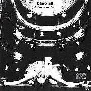
Judio!
09.09.13 | @JaimieTwort: I suppose that's fair. Amon Amarth don't try to be symbolic with their albums cover or anything, they are really cool to look at and accurately describe the music being played on the album.
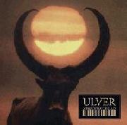
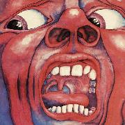
12 is my favorite album art of all time. The cover, combined with the eeriness of the first song, "Black Sabbath," used to scare the shit out of me when I was a kid haha. I had some kind of fucked up dream about the album art when I first listened to the album. |
JamieTwort
09.10.13 | "landscapes make the best artworks"
Yeah I agree. A lot can be said with a landscape image, especially with regards to atmosphere and even emotion in some cases.
@Judio: That's cool that 12 had such an impact on you, that's exactly the kind of thing I'm talking about with this list. |
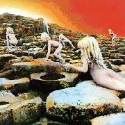
Rowan5215
09.10.13 | 18 is pretty cool, I think it's meant to be a guy in a tree. Oh and underrated as hell album as well of course. |
JamieTwort
09.10.13 | Yeah I think that's what the film still is of. And agreed, really underrated album. |
Rowan5215
09.10.13 | Stay and Childhood's End > most other songs
I wonder what the film's about/if it's any good. |
JamieTwort
09.10.13 | Childhood's End is definitely my favourite from that album and yeah Stay is fantastic too.
Yeah, I wonder. I'd like to see it one day. |
Rowan5215
09.10.13 | Wright's vocals in Stay uuuuuuuugggggggghhhhaaahhhhh why did we have to stop singing
Yeah I get the impression that it's fairly indie/arthouse but it still sounds cool |
JamieTwort
09.10.13 | Wright sounds amazing in that song, agreed. |
Rowan5215
09.10.13 | Wright sounds amazing in every song Darkside and before, imo. That's why he's one of my favourite singers ever. His vocals didn't quite hold up after that though, unfortunately. |
JamieTwort
09.10.13 | He definitely didn't sing as much as he should have done. I prefer Gilmour's voice overall but Wright was definitely Floyd's second best singer. |
Rowan5215
09.10.13 | I reckon they're about equal at their peaks (Obscured/Darkside for Wright, WYWH/Animals/The Wall for Gilmour) but Wright's voice didn't hold up nearly as well as time went on, if you listen to his solo albums (which you really should if you haven't) or live stuff from not long before he died like Live at Gdansk, or even Wearing the Inside Out, his vocals were a bit weaker than usual, probably due to sickness, although still good. Whereas Gilmour is still rocking a beautiful voice at, what, 67? |
MoosechriS
09.10.13 | now this is a damn good list, agree so hard on 8. I often get mental images when listening to music and i find a lot of the time i associate with the overall colours of the artwork too. |
JamieTwort
09.10.13 | Thanks dude. Yeah I do the same thing, for example with 16 I visualise most of the album's concept in black and white. |
Jethro42
09.10.13 | Nice list, JT |
JamieTwort
09.10.13 | Cheers, Jethro. |
TronaldDump
09.10.13 | sweet list |
JamieTwort
09.10.13 | Thanks man. |
rockandmetaljunkie
09.10.13 | Amazing list dude, the descriptions you used makes it very informative.
12, 17, 19 are my favorites. I haven't heard 7 but the artwork is equally great.
Candlemass's sophomore effort has also an amazing artwork, which is part of a painting series. If
you're interested check it out.
Cathedral is also a band with some superb album artworks. |
JamieTwort
09.10.13 | Thanks dude.
"Candlemass's sophomore effort has also an amazing artwork, which is part of a painting series. If you're interested check it out."
Yeah Nightfall has great artwork, I almost included it actually. I wasn't aware that the painting was part of a series, I'll have to look into that. |
rockandmetaljunkie
09.10.13 | The Voyage of Life
http://en.wikipedia.org/wiki/The_Voyage_of_Life
Here you are Jamie. |
JamieTwort
09.10.13 | Awesome, thanks. |
somnolence
09.11.13 |
edition rz |
Irving
09.11.13 | You should be staffed on the quality and effort of this list alone. Nicely done mate. Really enjoyed reading this. |
JamieTwort
09.11.13 | Haha, thanks Irving, glad you enjoyed it. |
hogan900
09.11.13 | Love the list, all of these would be in my top 30 almost. A few other good ones would be The future is cancelled, What it takes to move forward, déjà entendu, and even a shipwreck in the sands. |
JamieTwort
09.11.13 | Glad you liked the list. I really like the artwork for What It Takes to Move Forward, although I have to admit I haven't heard the album. |
Nagrarok
09.11.13 | 'For me a well thought out album cover can shape the feel of an album and complement the music within.'
Definitely. Great choices here, still need to hear 1 and 7. |
JamieTwort
09.11.13 | Hey Nag. 7 is amazing as I'm sure you've gathered from all the praise it gets on this site. 1 is one of my favourite ambient albums, the song Taken is glorious. |
Jethro42
09.12.13 | ^Taken is great. It reminds me Godspeed You Black Emperor. |
MikaelAkerfeldtt
09.12.13 | Thanks for 9 & 10.
Some very good prog in your ratings. |
tommygun
09.12.13 | great stuff jamie
really enjoyed reading this |
joshuahuntkc
09.12.13 | http://joshuahunt.bandcamp.com/album/by-the-moonlight |
JamieTwort
09.12.13 | @Jethro: Glad you like Taken, definitely one of my favourite ambient pieces.
Haha you're welcome Mikael, thank YOU for 9 and 10.
Thanks Cap and tommy. |
TheNotrap
09.12.13 | Some cool album artworks here. Nice list. |
JamieTwort
09.12.13 | Cheers Notrap. |
menawati
09.12.13 | "a well thought out album cover can shape the feel of an album and complement the music within"
i agree, especially when you havent yet heard the music it can affect how you hear it the first time |
JamieTwort
09.12.13 | Yeah definitely. |
EyesWideShut
09.12.13 | what about Bowie's Low? Dont you just love that hoodie/sweater? |
JamieTwort
09.12.13 | Haha no, that one doesn't really do it for me. |
OmairSh
09.13.13 | I've never liked Death album covers. I think Damnation and Heritage have better covers than GR and morningrise |
JS19
09.13.13 | The most important thing about artowrk for me is the overriding colour. That colour is what shapes the mood I get from the album every time I hear it |
JamieTwort
09.13.13 | @Omair: I'm not to keen on Death's earlier album covers but Rene Miville's artwork really interests me, which is as much to
do with the unusual techniques he uses as much as what the cover's look like. As for Opeth I obviously disagree. Heritage's
cover is kinda cheesy and don't get me started on those fucking heads in the tree. Damnation has a pretty sweet cover but it
doesn't influence my appreciation of the music like the covers on this list do (probably partly due to the fact that I'm not a huge
fan of the album). |
Rowan5215
09.13.13 | @Jamie Have you ever heard Broken China by Richard Wright? |
JamieTwort
09.13.13 | @JS19: The colour is certainly one of the most important aspects of album artwork but I find that what the cover actually depicts influences the feel of the album more for me, especially if it relates to the album's concept or creates an atmosphere reflected in the music. |
JamieTwort
09.13.13 | @Rowan: No I haven't, I'll check it out. |
Rowan5215
09.13.13 | It's quite amazing, probably the darkest album tonally to be associated with the Floyd but it's definitely worth it. Have you heard Roger's solo stuff at all? |
JamieTwort
09.13.13 | Cool, sounds interesting. Yeah I've heard Pros & Cons and Amused to Death both of which I thought were good, particularly the latter. I prefer most of Gilmour's solo material over both of those though. |
Rowan5215
09.13.13 | Yeah Amused to Death is incredible, I'd pretty much put it up there with Floyd's best. I love On an Island but I'm not too big on Gilmour's other two. |
JamieTwort
09.13.13 | I never liked Amused to Death as much as a lot of people seem to. It's great but nowhere near Floyd's best albums for me. Gilmour's solo albums aren't anything special but musically they're superior to Waters' imo. 'Murder' from the album About Face is one of my favourite Gilmour tracks. |
Rowan5215
09.13.13 | Musically Gilmour's are superior of course but my God the lyrics on Amused to Death; have you read them while listening to the album? In that respect I think it's one of the best things Waters has ever done. Granted, I do need to give About Face and Gilmour's s/t a bigger chance than I have previously. |
JamieTwort
09.13.13 | I definitely need to give Amused to Death another listen while paying closer attention to the concept. It's been a long time since I last listened to it. I have the CD somewhere, I'll try and dig it out sometime soon. |
sniper
09.13.13 | exemplary list |
JamieTwort
09.13.13 | Thanks. |
Rowan5215
09.13.13 | I strongly advise it because that's the way to truly appreciate the album, and give Broken China a shot when you can. |
JamieTwort
09.13.13 | Yeah I'll definitely check Broken China as well. |
Evreaia
09.13.13 | I like albums with paintings, like Burzum's latest albums for example. |
JamieTwort
09.13.13 | Paintings can make really good album covers, especially if they go well with the overall feel and atmosphere of the album. |
OmairSh
09.13.13 | Storm corrosions music should have been twisted like the album cover, that was a painting as well |
JS19
09.14.13 | Storm Corrosion just ended up being kinda boring an uneventful. I would have preferred 'bad', if only they'd tried something exciting |
JamieTwort
09.14.13 | I like Storm Corrosion. Granted it could have been better but I'm glad they actually tried something different with regards to the overall sound of the album. They could have just done a Opeth prog album meets Wilson's current prog sound which would have been the predictable thing to do.
As for it's cover art, I actually think it does reflect the style and atmosphere of the music. |
Minushuman24
08.05.17 | 7, 11, and 17 are my favorites here |
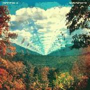
smaugman
08.05.17 | Moving mountain's Pneuma artwork gives the album a nocturnal vibe |