Album Rating: 5.0
That was the one with the water, wasn't it? That one's neat, too ... I haven't got it near me right now. It's a cool booklet in general for sure. I mean, nothing mind-blowing (and doesn't have to be), but well-made.
But I personally think that the One Cold Winter's Night dvd cover fits the mood of this album better than the actual cover - I think's it's got more of a "blue" than a "red" feeling to it. All the ethereal stuff going on, the wintery atmosphere on songs like Abandoned. The only songs on here I'd describe as "red" are March of Mephisto, This Pain and the t/t.
|
| |
Album Rating: 5.0
I could see it, although I like the fact that the album broke the purple pattern they had up to this point.
|
| |
Album Rating: 5.0
Yes, me too. This was still designed by the same guy who made all the ones before it, and it was his last one for Kamelot. So this is basically a transition album in terms of artwork: new look, old designer
|
| |
Album Rating: 5.0
I actually like the Ghost Opera artwork tbh. Too bad the album isn't nearly as good as this or Epica though
|
| |
Album Rating: 5.0
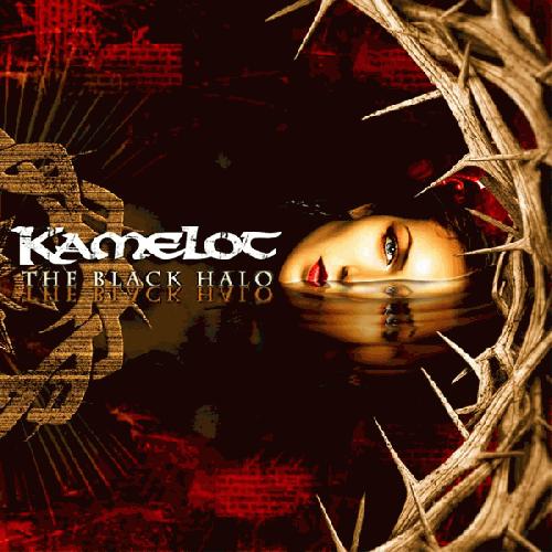
Best power metal album IMO. Just perfect. And regarding the cover, it's probably their best cover art too. Most of their artwork before is awful.
Ghost Opera's artwork is dreadful... so incredibly cheesy. The latest two have pretty neat cover art though.
|
| |
Album Rating: 5.0
I don't like the obvious "manipulated photography" style of the Silverthorn cover. It's okay though, even though it's hilarious that she has a freaking piercing when the album's story is set it the Victorian age
Haven's cover is good though
|
| |
Album Rating: 5.0
Yeah, the Silverthorn artwork is pretty meh
|
| |
The review sounds promising. But I can hardly believe this a all time top 5 progmetalmasterpiece. I will give this a try.
|
| |
Album Rating: 5.0
It's p good, you should dig
|
| |
Album Rating: 5.0
more like fantastic :]
|
| |
Kamelot < 3
|
| |
Album Rating: 5.0
Camel < 3
|
| |
Kamel < 3
|
| |
Album Rating: 5.0
Camelot < 3
|
| |
|
|