Album Rating: 4.5
What's wrong with the album art?
|
| |
Album Rating: 5.0
It looks nice in physical, if that means anything to you.
|
| |
Album Rating: 4.5
for sure guy, i haven't actually seen this record anywhere. just reminds me of an anime mango or whatever you call it, lol. ecailles also has a bit of that thing going on but less so. for representing black gaze, something like the style from the 3nd and 2nd lantlos LPs or i guess les voyages de l'ame maybe. it's might seem like a trivial thing to care about but man the artwork for an album is super influential for how i feel about the album musically as well.
guess the artwork here totally doesn't match the music for me and it creates a kind of dissonance in how i feel about the album
|
| |
Totally get it man, covers are really important. I love this I love this one though, despite it looking like a papaya.
|
| |
Album Rating: 5.0
I think you gotta see it man. Maybe I'll upload a couple pics. IMO it fits perfectly.
|
| |
Album Rating: 3.5
This cover is so much nicer than the 2nd and 3rd lantlos albums what
|
| |
Album Rating: 4.5 | Sound Off
Of course it reminds you of an "anime mango", because the album is inspired by Princess Mononoke (and the art by Yamamoto Takato).
|
| |
Album Rating: 4.5
sure rik, i saw that film a billion years ago.. i never have been a fan of that style anyway, and in my heart it's in the polar opposite region from where blackgaze is. @benthatsmyjamin different strokes, 2nd and 3rd lps of lantlos have some of my favorite art style, & i think it matches blackgaze perfectly. i could go further to say the style on 2nd and 3rd lantlos straight up is my fav. art style
|
| |
Album Rating: 3.0
anime mango lmfao
|
| |
Album Rating: 3.5
Fair enough, I just think it's an incredibly colourful genre as opposed to the black/grey bleakness of black metal (which those lantlos covers seem to reflect), which is why so many bands go for covers like this, Sunbather, Melting Sun etc
|
| |
Album Rating: 4.5
that may be the more valid interpretation if there is one, i get you. but look at the artwork for the debut heretoir LP, that is a perfect visual representation of how i see blackgaze. curiously their following LP has the same color scheme as melting sun & sunbather.
|
| |
Album Rating: 3.5
Interesting, I think the colour scheme probably definitely caught on after Sunbather! I imagine you like the new Alcest cover then? It does nothing for me personally but sounds like it would be right up your street. It all just sounds so bright to me!
|
| |
Album Rating: 4.5
yeah i mentioned in another thread i liked the new art, reminds me of maybe something ulver would have had designed.
(blackgaze sounds black to me! but there's a paradoxical brightness as well haha. i didn't like melting sun & it's artwork when the album came out but now i love it (obviously, i have it 5'd))
|
| |
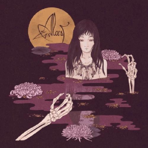
Album Rating: 5.0
This art work fits the music perfectly tbh. It's beautiful and violent, young and old, living and dying, bliss and pain
|
| |
Album Rating: 4.5
that's a lot to get out of a picture of a person half submerged in water haha
|
| |
Album Rating: 4.5 | Sound Off
... with a moon, and roses, and bones around her neck, and skeleton arms coming out of the water ...
The rest of the artwork is also georgeous
|
| |
Album Rating: 4.5
ooh spooky, skeleton arms
i love the design for souvenirs d'un autre monde
|
| |
Album Rating: 4.5 | Sound Off
Every Alcest album has amazing design. Can't wait to see the new one's artwork (beyond the cover). They always make sure the physical releases look beautiful.
|
| |
when does the new one come out
|
| |
Album Rating: 5.0
This is not my favorite but it's weird enough to pass.
|
| |
|
|