"yeah orange and pale blue don't clash smh"
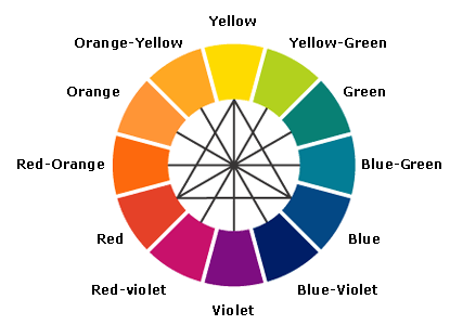
the funny thing is that orange and blue are literally complimentary colours you fucking dumbass
|
| |
in this case they don't because there's a pretty smooth transition between the two.
and besides, they're used for contrast, so to say they clash is really just saying they successfully accomplish what they aim to.
it's not really a criticism.
|
| |
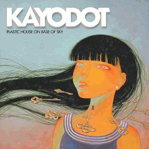
the only thing that clashes is the ridiculously bold white logo
|
| |
Album Rating: 2.5
yea kinda like red and green!
sach: i get that clashing colors can look nice -- cian and orange are used for contrast in p. much everything -- but when u gonna execute it like how monitors bleed green and red, it's gonna look awful
|
| |
dont worry asfefaewf im here to help, welcome to third grade art class; http://www.gardening.cornell.edu/homegardening/feature_gardening/img/using_color/17.gif
|
| |
Album Rating: 3.5 | Sound Off
"the only thing that clashes is the ridiculously bold white logo"
^"This"
|
| |
"yea kinda like red and green!"
wow good job buddy!!
|
| |
"yea kinda like red and green!"
so... I heard you're a bit of a grinchy cunt
|
| |
lets take this kids word for it:
http://www.sputnikmusic.com/forums/image.php?u=961095&dateline=1467352441
over thousands of years of art history
|
| |
Album Rating: 2.5
old ass paintings don't clash ugly ass colors pots, gotta open a book sometime
|
| |
the gestalt of the backdrop of that avatar is just so austere
|
| |
"old ass paintings don't clash ugly ass colors pots, gotta open a book sometime"
actually renaissance paintings are notorious for "clashing" complimentary colours like blue and orange together. open your eyes sometime.
|
| |
Album Rating: 2.5
[citation needed] wanna see a renaissance painting ugli-ly mix colors horribly, smh bro
|
| |
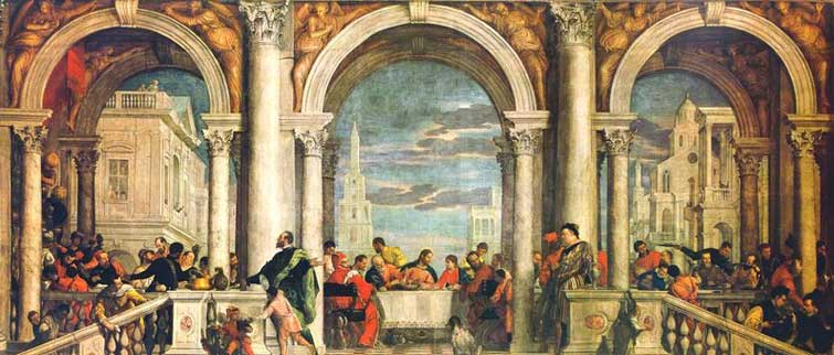
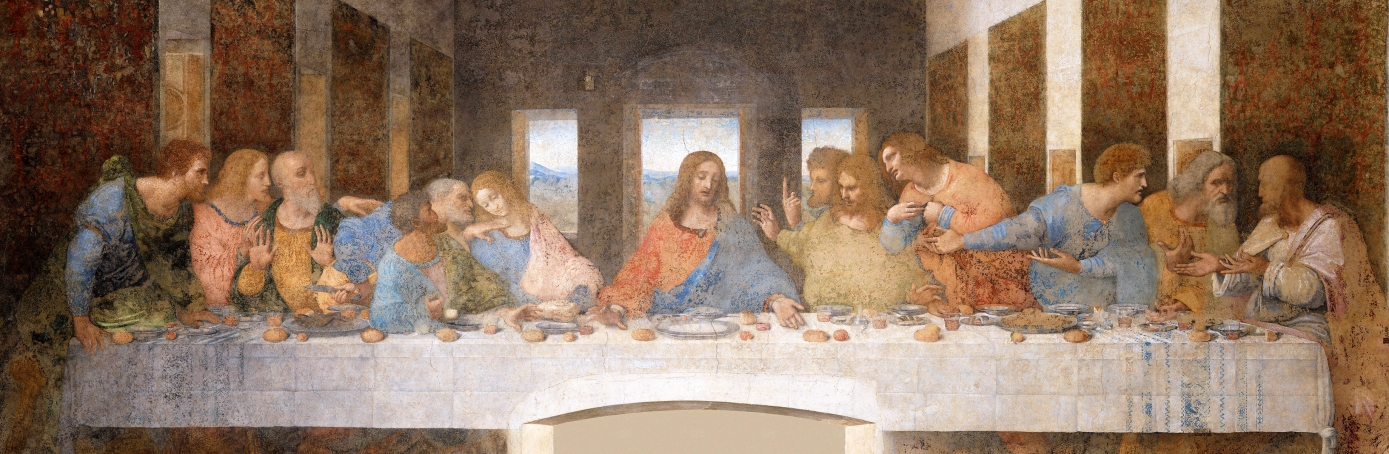
https://mauganskgv.files.wordpress.com/2013/02/delivery-of-the-keys-to-saint-peter-3915.jpg
whoa orange and blue, green and red,
http://www.historyofpaintings.com/images/Veronese-Feast-in-the-House-of-Levi-Venice.jpg
damn there it is again
http://cdn.history.com/sites/2/2013/11/last-supper-Da_Vinci-H.jpeg
holy fuck! and again! its almost as if user asdfaewfg is fucking retarded!
|
| |
http://i.imgur.com/UKMQnBn.jpg?1
beautiful
|
| |
Album Rating: 2.5
not the same kinds of max-saturation ass colors bro, open ur eyes, u use old ass concepts of art w/o knowing how to apply them bro
|
| |
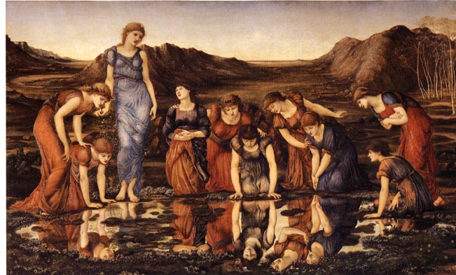
purple and orange?
http://www.victorianweb.org/painting/bj/paintings/7.jpg
hmmm
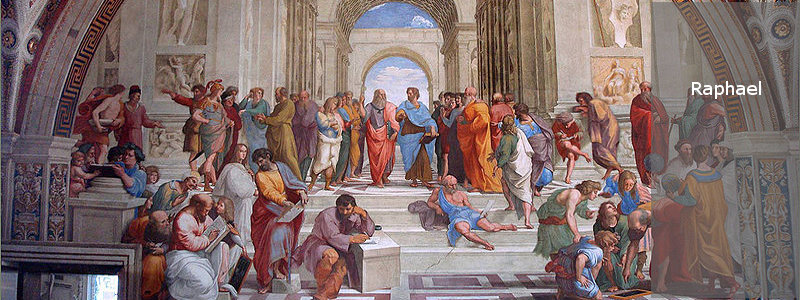
literally every colour from this album cover?
http://www.italian-renaissance-art.com/images/RaphaelSlideH.jpg
check
wow its almost like they were on to something with that so called 'wheel' of 'clashing colours'
god forbid someone use natural pairings of complimentary pastel colours tho
|
| |
Album Rating: 2.5
read my comment bro, learn how to aesthetics
|
| |
"not the same kinds of max-saturation ass colors bro"
actually many of those paintings are far more saturated which is why they have the piss yellow hue to them but tell me more about literally every facet of art you are clueless about?
|
| |
this fucking dumbfuck think pastels are "max saturation" it would not be possible to be more stupid tbh
|
| |
|
|

