Album Rating: 2.5
smh reported
|
| |
Album Rating: 5.0 | Sound Off
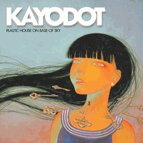
idgaf what you say pots that album art screams paprika to me. succcc ittttt ;;;;;)))))
its more about the mental association it conjurs up for me than anything explicitly "anime" about the art
|
| |
"colors clash so badly, and it's such an uninspired painting"
you're objectively wrong. go pick up a colour wheel you try hard mouth breathing outsider edge purveyor. if you're going to actively try to be contrarian at least think up some intelligent criticisms instead of actively retarded criticisms. piece is far too vivacious and vibrant to come off uninspired. this is also pretty much empirical. do better.
|
| |
Album Rating: 3.5
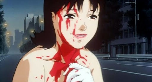
and yeah the only anime Hirasawa was really involved with is Satoshi Kon's stuff and I mean... http://iv1.lisimg.com/image/3980484/600full-perfect-blue-screenshot.jpg
no
|
| |
Album Rating: 2.5
the only thing "vibrant" about the painting are its ugly ass colors smh
|
| |
http://theflenser.com/wp-content/uploads/2016/04/FR69_cover1400x1400-1024x1024.jpg
https://images2.alphacoders.com/217/217120.jpg
oh wow yep i see it now basically the exact same medium
|
| |
Album Rating: 3.5
"idgaf what you say pots that album art screams paprika to me. succcc ittttt ;;;;;)))))"
nope, I wouldn't even compare it to Paprika
|
| |
"the only thing "vibrant" about the painting are its ugly ass colors smh"
*is
no wonder you have such a struggle finding appropriate word choices for your critiques.
|
| |
looks nothing like anime, but it does look like an avant garde metal cover (not saying this is avant garde metal). i swear they all have paintings like this lol
|
| |
the colours don't really clash, but they're def waaaay too bold and vibrant for my liking.
kinda like staring at neon lights. hurts my eyes after a while.
not really seeing anime either. i just see something that I find aesthetically displeasing.
|
| |
keyblade most spot on so far
asefef23 most completely off base as always, bordering illiterate
animalsassummit somewhere in between
jasi voice of reason as per usual
|
| |
iloveyou dropping some reasonable words for the finishing touch
|
| |
if it had a better or even different color logo it would look sweet as hell
|
| |
Album Rating: 3.5
nowhere near enough gore sach agreed
|
| |
tfw u asdfpewnfwhef and sach is more reasonable than you
|
| |
Album Rating: 2.5
yeah orange and pale blue don't clash smh
|
| |
its not really my cup of tea either but ill defend it from sheer stupidity at least
|
| |
Album Rating: 3.5 | Sound Off
The internet's most employed horse yiff authority
|
| |
Album Rating: 3.5
"yeah orange and pale blue don't clash smh"
sunsets?
|
| |
Album Rating: 5.0 | Sound Off
yeah i get anime vibes from it. i dont think anyone can really control the associations art gives them, so i stick w that
|
| |
|
|

