Album Rating: 5.0 | Sound Off
yep
|
| |
nah
|
| |
Album Rating: 3.5 | Sound Off
Sad update, I listened to it again today and this time it made me want to die. Someone hold me pls.
|
| |
become one with my loving embrace
|
| |
its good but not excellent
|
| |
Album Rating: 5.0 | Sound Off
you're too busy talking
and i wasn't even listening
|
| |
Album Rating: 2.5
seems u ain't even listened to the album either
|
| |
Album Rating: 3.5 | Sound Off
PLS DELET
|
| |
Album Rating: 3.5 | Sound Off
AaS, do you want my copy? Holding out for selective memory erasure to go mainstream now. For health. :'(
|
| |
Album Rating: 5.0 | Sound Off
Nah mang, but ty, I gots my own :3
|
| |
Album Rating: 3.5 | Sound Off
Trust issues acquired
|
| |
Album Rating: 3.5 | Sound Off
Ok, ily, thank :'(
|
| |
Album Rating: 4.5 | Sound Off
Yo this thing was easily a 3-3.5 first listen but after a few spins oh how wrong I was
|
| |
terrible album
|
| |
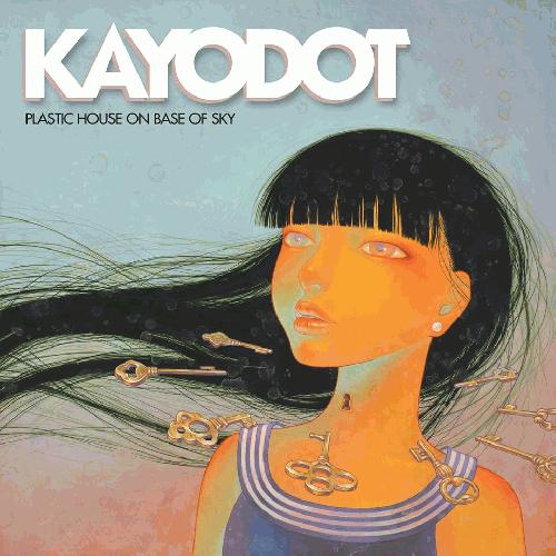
Album Rating: 2.5
awful artwork can't be bothered to check again
|
| |
artwork is shite too, yea
|
| |
Album Rating: 3.5
leave the artwork alone
|
| |
Album Rating: 3.0
it's ugly yeah
|
| |
Album Rating: 2.5
band will never top their artwork on maudlin tbh
|
| |
Album Rating: 3.5 | Sound Off
I love that Toby usually does his own artwork! Very special thing. All of his covers are wonderful.
Tbh when the press release for this came out I was a little bit nervous based on the cover.
The painting itself is cool. I do find it fights the content of the music for me a little bit. I'm seeing it connecting most closely to Amalia's theme, in terms of the color and light, but I get sort of a disconnect where it would seem like it's supposed to be Amalia, though based on the lyrics I don't think it's Amalia and then it's like well what. It def sets up an expectation for a way airier record than of course we have on our hands here.
But it is quite a nice painting on its own terms, and I can see it working.
The type treatment however, is a HUGE fucking disaster. It almost could not be doing Fuco's work more of a disservice. Totally flattens her work down to a piece of paper. That drop shadow. Smdh. The painting is now the BACKGROUND and the logo is two cut out pieces of paper placed on top of a flat image. Really a shame because the painting has such a great quality of spaciousness on its own. I get the impression they were going for something sort of like the type on Flaming Lips At War with the Mystics (really good cover), which could have worked too. It was just really handled pretty poorly, and the result looks pretty cheap and thin, like a bootleg, or an ad based on the real artwork that some venue promo guy threw together a few days before a show. Total amateur hour.
Check it out without type: https://i.ytimg.com/vi/afUQv9wxw34/maxresdefault.jpg
SO much better holy shit.
|
| |
|
|