select an antonym for fun
any one will do
its that
|
| |
Album Rating: 3.0
was hurry up, we're dreaming really a masterpiece though?
|
| |
no tbh
|
| |
Album Rating: 3.0
It took me until like last year to actually listen through it, but I can see why people are responding negatively to this one as a followup...
|
| |
Album Rating: 2.0
i really liked hurry up, but it isnt a masterpiece
|
| |
Album Rating: 2.5
Hurry Up would have been a sick album if wasn't a double album packed with filler
|
| |
Album Rating: 3.0
Yeah, seems odd to include all of the fluff just to call its 73 minute play time a "double album".
|
| |
Album Rating: 2.5
Hurry Up is close to being a masterpiece for me
|
| |
Album Rating: 1.5
HUWD is a masterpiece. Still not getting the hate with this though. It's still got the classic M83 synth flair overall, just this time with pop songs
|
| |
i mean yeah if you have this fucking garbage 4.5'd HUWD must be like a 92/5 for u but its actually a light 4
|
| |
lol
y'all need more bjork, the only true 5.0
|
| |
Album Rating: 1.5
This is actually awesome. Probably will be in my top 10 this year but this has been a garbage year for music so far. This has been the only anticipated album to not let me down. It may be as shallow as a kiddie pool but it doesn't stop it from being fun
|
| |
this is actually not awesome and this has been a great year for music so far.
|
| |
Album Rating: 1.5
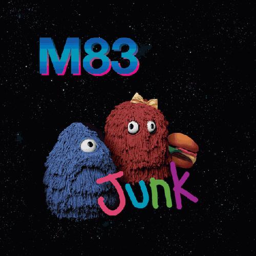
I'd rather just stare at this album's cover in silence than listen to this again.
|
| |
Album Rating: 1.5
Cover art is pretty garbage but I love the musics
|
| |
cover art is literally the best thing about this by some insane exponential level
|
| |
Album Rating: 1.5
I think he should've removed the horrid M83 and the fry kids and the stupid cheeseburger and blown up the Punky Brewster-esque fonted "Junk" and centered it with the star background. I like the Punky Brewster font
|
| |
i'm glad you weren't in charge of the cover art
|
| |
"I think he should've removed the horrid M83 and the fry kids and the stupid cheeseburger and blown up the Punky Brewster-esque fonted "Junk" and centered it with the star background. I like the Punky Brewster font"
its legitimately frightening to me that you can like this music and not like the art considering how immaculately telling it is of both the over-all quality and aesthetic of the album. i feel that you are a very confused person suffering from some severe inner-turmoil and i feel nervous being around you.
|
| |
he's aesthetics all wrong
|
| |
|
|