Kayo Dot Plastic House on Base of Sky
» Back to review

Comments:Add a Comment 
Asdfp277
July 1st 2016


25898 Comments

Album Rating: 2.5

so, where's the max-saturation ass "piss yellow"? sure bro

Lord(e)Po)))ts
July 1st 2016


70256 Comments


"complimentary colours clash and pastels are too saturated" - asfegaehsefnew727

Lord(e)Po)))ts
July 1st 2016


70256 Comments


"where's the max-saturation ass "piss yellow"? "

where?

well on 90% of the paintings that come up when you google renaissance paintings for one ;D

https://www.google.ca/search?q=renaissance+paintings&source=lnms&tbm=isch&sa=X&ved=0ahUKEwibh-bVzNHNAhVB4GMKHcLNAOEQ_AUICCgB&biw=1323&bih=668

Lord(e)Po)))ts
July 1st 2016


70256 Comments


always here to help the severely mentally deficient bud good work today

Asdfp277
July 1st 2016


25898 Comments

Album Rating: 2.5

literally none of these but nice try

ggglllooommmppp
July 1st 2016


65 Comments

Album Rating: 3.5 | Sound Off

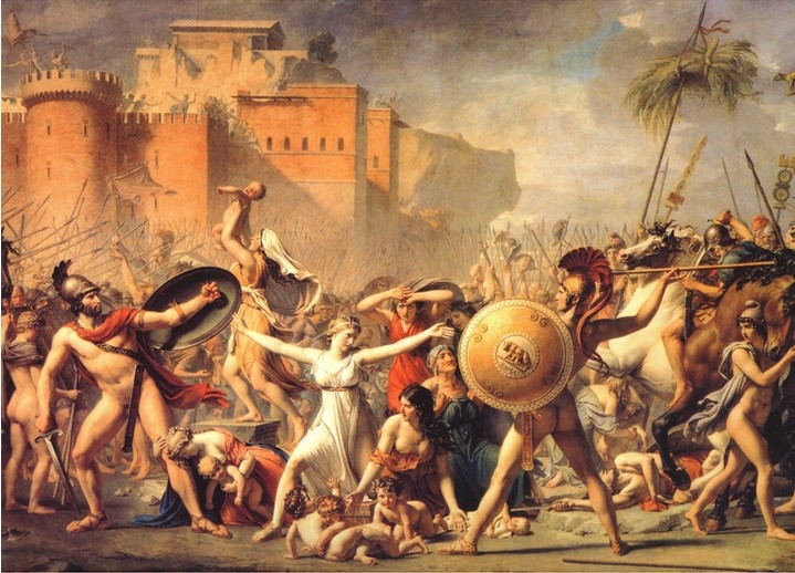
So, not that color decisions have to be theoretically explainable to work, but there's definitely a tried and true color logic at work here. It's definitely intended to be "wrong" color and create a kind of impossible quality of light. Anyway whatever your opinion of the painting, maybe we can all agree that the complex color harmony probably makes some sense in relation to the bizarre tonality of the music?

Also I would like to testify that the whole package looks better in print than on screen.

Btw I'm so happy to see a hot debate about color going down right here thank you this rules

Lord(e)Po)))ts
July 1st 2016


70256 Comments


this would be asfefaeh's renaissance portrait tbh; https://s-media-cache-ak0.pinimg.com/236x/8f/ea/2b/8fea2b0289d693111c3387b98f1b61fb.jpg

Asdfp277
July 1st 2016


25898 Comments

Album Rating: 2.5

i did say that complimentary colors can be used to great effect tho, just this one sucks

Lord(e)Po)))ts
July 1st 2016


70256 Comments


"literally none of these but nice try"

http://www.mrdowling.com/images/704mona-lisa.jpg

https://upload.wikimedia.org/wikipedia/commons/4/46/Andrea_Mantegna_-_The_Court_of_Mantua_-_detail.JPG

https://s-media-cache-ak0.pinimg.com/736x/6f/6c/ba/6f6cba158b98cc89be8dbabcb7cb5223.jpg

http://www.metmuseum.org/toah/images/h5/h5_12.211.jpg

http://g01.a.alicdn.com/kf/HTB10AEXKpXXXXaVXVXXq6xXFXXXc/The-Renaissance-paintings-wall-art-The-woman-in-the-war-home-decoration-oil-painting-on-canvas.jpg

http://www.essential-humanities.net/img/art/paint4_2_19.jpg

http://cdn.thedailybeast.com/content/dailybeast/articles/2014/12/03/great-renaissance-art-thrived-amid-filth/jcr:content/image.crop.800.500.jpg/47253450.cached.jpg

http://thisismyhappiness.com/wp-content/uploads/2011/08/the-cestello-annunciation1.jpgLarge.jpg

http://www.wallcoo.net/paint/Raffaello_Sanzio/wallpapers/1024x768/Raffaello_Sanzio_art_ml0007.jpg

http://www.mrdowling.com/images/704raphael.jpg


AnimalsAsSummit
July 1st 2016


6206 Comments

Album Rating: 5.0 | Sound Off

i hope toby reads this thread

Lord(e)Po)))ts
July 1st 2016


70256 Comments


http://www.larry-bolch.com/shade/color-light/Saturation2.jpg

Lord(e)Po)))ts
July 1st 2016


70256 Comments


get learnt you fucking douche

Jasdevi087
July 1st 2016


8176 Comments

Album Rating: 3.5

asdfp9237592 it's blatantly obvious that you do not understand what the piss-yellow actually is so if you could stop and just say "I do not like this picture it is not my sort of thing" then that would be really nice

Asdfp277
July 1st 2016


25898 Comments

Album Rating: 2.5

the mona lisa uses super-saturated colors agreed


i also like how u pick the most horribly-scanned art pieces' photos to defend urself @ the artemisia one

Jasdevi087
July 1st 2016


8176 Comments

Album Rating: 3.5

I'm gonna count to 3

Asdfp277
July 1st 2016


25898 Comments

Album Rating: 2.5

85% saturation orange is subdued agreed

Pon
Emeritus
July 1st 2016


6187 Comments


There are so many layers of sarcasm in this thread it's delectable

Keyblade
July 1st 2016


30810 Comments


all this talk of colours is hurting my colour blind brain

Pon
Emeritus
July 1st 2016


6187 Comments


Yo key your pic is hurting my eyes what with the blue of his suit clashing with the orange dragon ball pls remove

ggglllooommmppp
July 1st 2016


65 Comments

Album Rating: 3.5 | Sound Off

My fucking sides rn


You have to be logged in to post a comment. Login | Create a Profile


STAFF & CONTRIBUTORS // CONTACT US

Bands: A B C D E F G H I J K L M N O P Q R S T U V W X Y Z


Site Copyright 2005-2023 Sputnikmusic.com
All Album Reviews Displayed With Permission of Authors | Terms of Use | Privacy Policy