Album Art Gallery Part 7: 1975
I've always loved album artworks. I see them as its own art form, separate (though sometimes related) to the music contained within them. So even if many album cover lists exist already in Sputnik, I wanted to start my own series showcasing the ones that caught my attention, wether it is because I think they are beautiful as works of art, interesting in concept or simply because I think they look "cool" regardless of a deeper value. This is part 7 and, as always, recs are welcomed |
| 1 | 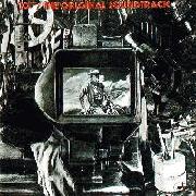 | 10cc
The Original Soundtrack |
| 2 | 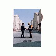 | Pink Floyd
Wish You Were Here
One of the best ever for me. Incredible composition, mysteryous aura. Love the small burnt paper effect. The whole package is awesome as well and worth checking, as it is the case with many of these artworks. Sadly with streaming and the internet nowadays, people will only check the front cover of albums and nothing else |
| 3 |  | Kansas
Masque |
| 4 |  | Kansas
Song for America |
| 5 | 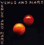 | Wings
Venus and Mars
One of the best examples I can think of minimalist artwork well done |
| 6 |  | Miles Davis
Pangaea |
| 7 |  | Miles Davis
Agharta
I could do without the greenery and the women but the perspective on the city accomplishes a feeling of flying over it and whatever that red thing is in the middle it adds nicely |
| 8 | 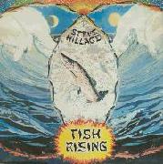 | Steve Hillage
Fish Rising |
| 9 |  | Outlaws
Outlaws |
| 10 |  | Tai Phong
Tai Phong
Love how it mixes old imagery with futuristic biological elements. The belts and chains work pretty well as vertical lines to create an effect of motion. An iconic one |
| 11 |  | King Crimson
USA |
| 12 |  | Popol Vuh
Aguirre |
| 13 |  | Chango
Chango |
| 14 |  | Soft Machine
Bundles
Reminds me of Botero |
| 15 | 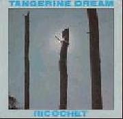 | Tangerine Dream
Ricochet |
| 16 | 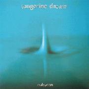 | Tangerine Dream
Rubycon
Great at how uncomplicated it is. It fits the unreal vibe of the album as well. Love the color too |
| 17 |  | Bola Sete
Ocean |
| 18 |  | Area
Crac! |
| 19 | 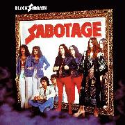 | Black Sabbath
Sabotage
While it is often ridiculed, most of the time it is only because of the clothes the band wears. I have to admit I've got a soft spot for 70's fashion but I can certainly see how I am a minority on that one. Nevertheless, I interpret the reflections facing the wrong way as an interesting take on the albums' title |
| 20 | 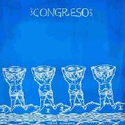 | Congreso
Terra Incognita |
| 21 | 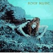 | Roxy Music
Siren |
| 22 | 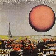 | Quiet Sun
Mainstream |
| 23 |  | Donald Byrd
Places and Spaces
Don Caballero is that you? The fact that it is the same plane in each frame instead of a different one (as is the case with the clouds) might be an analogy on the fluctuation of nature and how man-made stuff is way more simple, strict and limited by the rules of our own nature. Or maybe it has no meaning and it just looks cool, who knows? |
| 24 |  | Blue Oyster Cult
On Your Feet or on Your Knees |
| 25 |  | Pentacle (Prog)
La Clef Des Songes |
| 26 | 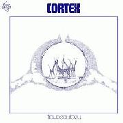 | Cortex
Troupeau Bleu |
| 27 |  | Budgie
Bandolier
Just like on their debut, Budgie gives us a rather silly but still eye-catching cover |
| 28 | 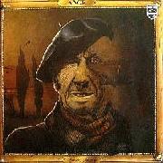 | Ange
Emile Jacotay |
| 29 | 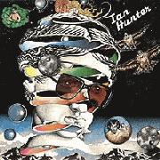 | Ian Hunter
Ian Hunter |
| 30 |  | Bernard Herrmann
Psycho
Not the one in the database. The one I'm talking about is simply the classic shot of the knife wielding hand through the bathroom curtain, one of the greatest shots in film history |
| 31 | 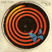 | Solution
Cordon Bleu
I like spirals (yes, I read Uzumaki) |
| 32 | 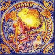 | Nektar
Recycled |
| 33 |  | Carpe Diem
En Regardant Passer Le Temps |
| 34 | 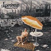 | Supertramp
Crisis? What Crisis?
Imitated by others like Rush and The Crystal Method I think this one is the best one at delivering its message while at the same time being the most comical looking one |
| 35 |  | Little Feat
The Last Record Album
Jello mountain! |
| 36 | 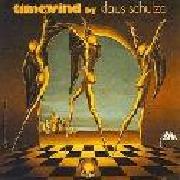 | Klaus Schulze
Timewind
The Dalí-like style with those long legged characters creates the kind of surrealist imagery I love |
| 37 |  | Hatfield And The North
The Rotter's Club |
| 38 | 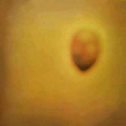 | Invisible
Durazno sangrando
How simple this is and the addition of the blurry effect make of this one a slightly unsettling one for me |
| 39 |  | Kool and The Gang
Spirit of the Boogie |
| 40 | 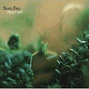 | Steely Dan
Katy Lied |
| 41 | 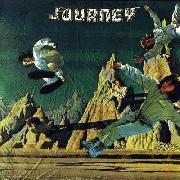 | Journey
Journey
I like how it messes with perspective and how the background, while disguised as a painting, is nothing but cloth |
| 42 |  | Jethro Tull
Minstrel in the Gallery |
| 43 | 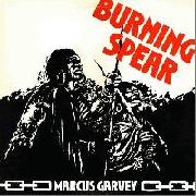 | Burning Spear
Marcus Garvey
Really dig the thick black lines |
| 44 |  | Phoenix (ROM)
Cantafabule
Despite its psychedelic design, I think this graphite tone fits way better than the usual style filled with many different colors |
| 45 | 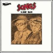 | Sugar Babe
Songs |
| 46 |  | Il Volo (ITA)
Essere o non essere? Essere! Essere!
Reminds me of Return to Forever's debut but from a way more interesting angle that gives it a first person POV |
| 47 | 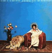 | Minnie Riperton
Adventures In Paradise |
| 48 |  | UFO
Force It
Another great example of Hipgnosis and their use of wordplays |
| 49 | 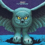 | Rush
Fly by Night |
| 50 | 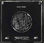 | Kraftwerk
Radio-Activity
Pretty straightforward but still efficacious |
| 51 |  | String Driven Thing
Keep Yer 'And On It
Perspective can turn something as simple as toothpaste into an interesting image |
| 52 |  | Gavin Bryars
The Sinking of the Titanic
I don't know what it is that I dig about an out of place square on a darkened city background but I dig it |
| 53 |  | Wigwam
Nuclear Nightclub
Stuff that would absolutely come out of a dream is always my kind of thing |
| 54 |  | Atoll
L'Araignee Mal |
| 55 |  | Sparks
Indiscreet
Love the structure of this one. The silly back cover is equally great |
| 56 |  | Harold Melvin and the Blue Notes
Wake Up Everybody |
| 57 | 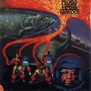 | Herbie Hancock
Flood |
| 58 | 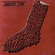 | Henry Cow
In Praise of Learning
The third sock in the series!. Probably my favorite of the trilogy since I think it looks better in red |
| 59 | 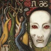 | Czeslaw Niemen
Aerolit |
| 60 |  | Led Zeppelin
Physical Graffiti
Excellent composition that creates the effect of the buildings looking as massive walls. The album title written letter by letter in the windows is a nice touch |
| 61 | 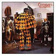 | Caravan
Cunning Stunts
Great one. Achieving this kind of stuff in the 70's, without photoshop and merely by manual photographic techniques is impressive |
| 62 |  | The Pretty Things
Savage Eye
Thanks Sputnik [828417984] |
| 63 | 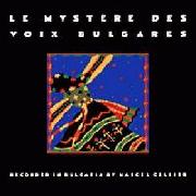 | Le Mystere Des Voix Bulgares
Le Mystere Des Voix Bulgares
The artwork in Sputnik's database isn't the one that made me add this album to the list but it is still a pretty cool artwork in its own |
| 64 |  | John Abercrombie
Timeless
The color gradient effect makes of what would be a rather generic cover a truly interesting one |
| 65 |  | Curtis Mayfield
There's No Place Like America Today
This one's certainly too "on your face" with its concept but that doesn't make it any less effective |
| 66 | 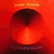 | Robin Trower
For Earth Below
A simple way to create a 3D effect but I still prefer the one on Twice Removed From Yesterday |
| 67 |  | Neu!
Neu! '75
Incredibly basic, but Neu managed to make of it an iconic one, a second time! |
| 68 |  | Los Jaivas
Los Jaivas
Spacey, spiritual and linked to nature and tradition, this one encapsulates Los Jaivas' sound pretty well |
| 69 | 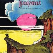 | Hawkwind
Warrior on the Edge of Time
Love this one. The colors and composition are great. Its eerie alien-like atmosphere fits perfectly with Hawkwind's vibe |
| 70 | 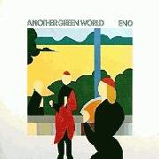 | Brian Eno
Another Green World
Great execution in simplicity |
| 71 |  | The Mothers of Invention
One Size Fits All |
|