Album Art Gallery: '59 to '69
I've always loved album artworks. I see them as its own art form, separate (though sometimes related) to the music contained within them. So even if many album cover lists exist already in Sputnik, I wanted to start my own series showcasing the ones that caught my attention, wether it is because I think they are beautiful as works of art, interesting in concept or simply because I think they look "cool" regardless of a deeper value. This list should be the shorter one of the series and, at the same time, the one spanning the biggest amount of years since before the 70's artwork wasn't usually seen as something worth of putting much effort into, being mostly modern paintings in jazz records and colorful pictures in psychedelic albums the ones that dominated and stood out throughout the decade. Obviously, I'm always looking for artwork recs! |
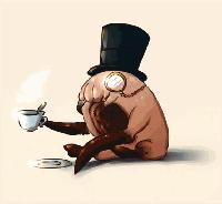
| 1 |  | Charles Mingus
Mingus Ah Um
1959. Both Mingus Ah Um and Dave Brubeck's Time Out feature paintings by S. Neil Fujita which showcase great modernist paintings with cubist elements to them. Jazz records from the late 50's and early 60's usually had artworks of this style |
| 2 | 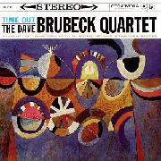 | The Dave Brubeck Quartet
Time Out |
| 3 |  | Eric Dolphy
Outward Bound
1960. I really like this slightly distorted painted of a seemingly disembodied Eric Dolphy head by painter Prophet Jennings |
| 4 |  | Ella Fitzgerald
Ella Wishes You a Swinging Christmas
Christmas albums certainly aren't the first ones to come to mind when thinking about interesting album covers but I really like this goofy, colorful horse |
| 5 |  | Gerry Mulligan and Ben Webster
Gerry Mulligan Meets Ben Webster
Tried to fix the artwork. Didn't work. Love you Sputnik |
| 6 |  | John Lee Hooker
Travelin' |
| 7 | 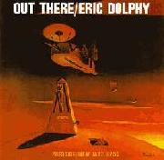 | Eric Dolphy
Out There
1961. I prefer this Prophet Jennings' painting over the one on Outward Bound. I really dig its eerie and otherwordly dadaist atmosphere |
| 8 | 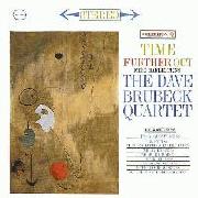 | The Dave Brubeck Quartet
Time Further Out
Joan Miró really deserves his spot as one of the great painters of the 20th century with his dreamlike surrealist work |
| 9 |  | James Brown
Live At The Apollo
1963 |
| 10 | 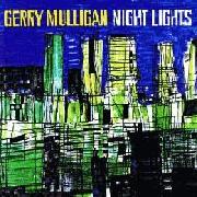 | Gerry Mulligan
Night Lights
I love cities skylines (including the video game lol), but if you add an almost cubist style to it with the colors and "crude" window lines this artwork has, then you will certainly grab my attention |
| 11 |  | Kenny Burrell and John Coltrane
Kenny Burrell and John Coltrane |
| 12 |  | Stan Getz and Joao Gilberto
Getz/Gilberto
1964 |
| 13 |  | John Coltrane
Coltrane's Sound |
| 14 |  | Gil Evans
The Individualism of Gil Evans
While it is a victim of the typical "too much focus on the text of the cover" that jazz records back then used to have this is, nevertheless, a pretty cool modernist sculpture |
| 15 |  | The Beatles
Help!
1965. Kinda funny that it doesn't actually spell help. I'm not usually a fan of band member shots, but this one really managed to become iconic |
| 16 |  | The 13th Floor Elevators
The Psychedelic Sounds of the 13th Floor Elevators
1966 |
| 17 |  | Baden Powell
Tristeza On Guitar |
| 18 |  | The Beatles
Revolver
Interesting approach to make in black and white a collage that certainly seems like it should've been done on the typical colorful themes of the era. The eyes are really impactful even so if they are in a slightly creepy way |
| 19 | | Sun Ra
The Lady with the Golden Stockings
Seems like this one isn't in the database(?). Unexpected |
| 20 |  | Donald Byrd
Free Form
I'm not sure if this one is a painting or a photograph but I really like it |
| 21 | 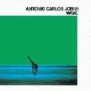 | Antonio Carlos Jobim
Wave
1967. I love this shot, and both its green and red variants add a great atmosphere to it |
| 22 | 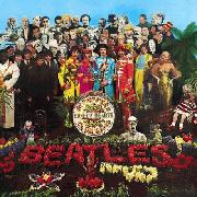 | The Beatles
Sgt. Pepper's Lonely Hearts Club Band
Artworks filled with small details or references that make you spend a lot of time looking at them are great |
| 23 |  | The Doors
Strange Days
One of my favorite album covers of the 60's. I love the way it brings a "surreal into the mundane" style |
| 24 | 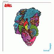 | Love
Forever Changes |
| 25 | 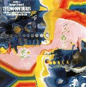 | The Moody Blues
Days of Future Passed
The colors in this one create a mood that feels both cold and warm at the same time, fitting pretty nicely into the albums' music |
| 26 | 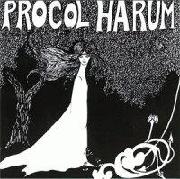 | Procol Harum
Procol Harum
The black and white color scheme only adds to the already detailed yet simple image |
| 27 |  | Thelonious Monk
Straight, No Chaser |
| 28 | 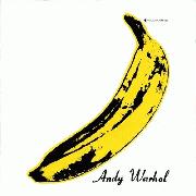 | The Velvet Underground
The Velvet Underground & Nico
Not much else can be said about this classic by Andy Warhol. I suppose it really is one of the oldest examples I can think of of an album artwork seen as an art piece of its own, which might have been pretty influential in the years to come as this idea started to grow from the 70's onwards |
| 29 | 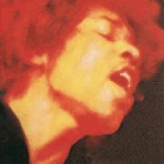 | The Jimi Hendrix Experience
Electric Ladyland
1968. The original artwork for Electric Ladyland is one of the first cases I can think of such a massive release having that controversial of an artwork as it took the album's title in a literal way with its nudity depiction |
| 30 |  | The Beatles
The Beatles
I like minimalist artworks which is something some people really hate. It really is impressive that this one became such a classic despite being almost completely empty |
| 31 |  | Archie Shepp
The Way Ahead |
| 32 | 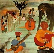 | The Band
Music from Big Pink |
| 33 | 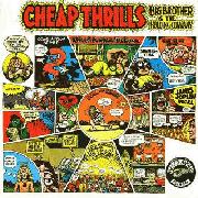 | Big Brother And The Holding Company
Cheap Thrills
I really enjoy comic like artworks as they manage to contain interesting details and even their own little stories. But if it is one that's also made by the legendary Robert Crumb, then that only makes it better |
| 34 |  | The Crazy World of Arthur Brown
The Crazy World of Arthur Brown
It really encompases Arthur Brown and his music |
| 35 |  | Deep Purple
The Book of Taliesyn |
| 36 |  | John Fahey
The Yellow Princess |
| 37 | 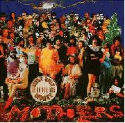 | The Mothers of Invention
We're Only in It for the Money
It's pretty cool that a parody cover manages to get a cult status that makes it stand out on its own, apart from the one it originally mocked, though some may argue that's expected from Zappa |
| 38 |  | The Millennium
Begin
Love how it manages to stay so simple yet it manages to showcase the influence of colorful and detailed artworks of the era. I really dig the window like framing as well |
| 39 | 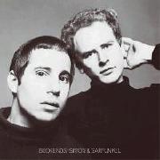 | Simon and Garfunkel
Bookends
I honestly tend to dislike band member album covers since they seem like a boring and generic way to present an album. But this one managed to become so iconic that it is probably the first image that comes to people's minds when they think of this legendary duo. What's to it that made it stand out? I don't know if I could tell really |
| 40 |  | Pink Floyd
A Saucerful of Secrets |
| 41 |  | The Pretty Things
S.F. Sorrow |
| 42 |  | Silver Apples
Silver Apples
Besides being an obvious reference to the band's name, I also enjoy the idea of the apples as an object of life surrounded by the silver lining, showcasing the mix between the band's psychedelic style and their colder early electronic sounds |
| 43 | 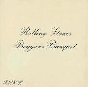 | The Rolling Stones
Beggars Banquet
The original one of course. I hate the censored version as I do with most censored artworks |
| 44 |  | Terry Riley
In C |
| 45 | 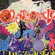 | The Zombies
Odessey and Oracle |
| 46 |  | Almendra
Almendra
1969. There is a weird feeling of melancholy and tragicomedy that attracts me to this classic cover |
| 47 | 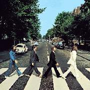 | The Beatles
Abbey Road
Duh |
| 48 |  | Can
Monster Movie |
| 49 |  | The Kinks
Arthur (Or the Decline and Fall of the British Empire) |
| 50 | 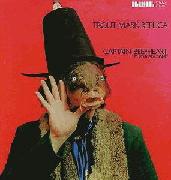 | Captain Beefheart and His Magic Band
Trout Mask Replica
I don't know if I can call this one "pretty" but it really summarizes the band's weird style while at the same time becoming a classic |
| 51 |  | Grand Funk Railroad
Grand Funk
I love the way that font stresses the shit out of my eyes |
| 52 |  | High Tide
Sea Shanties
Seems like something the legendary Kentaro Miura might have drawn if Berserk had a pirates arc |
| 53 | 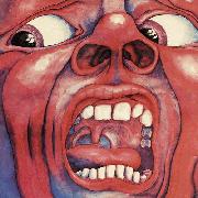 | King Crimson
In the Court of the Crimson King
Just like with Velvet Underground, there isn't much new that can be said about one of the most important album covers out there. It is tense and slightly disturbing, with colors and an expression that does justice to concepts such as fear, anger and stress but at the same time there is a weird beauty that attracts to it |
| 54 | 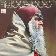 | Moondog
Moondog |
| 55 |  | Fairport Convention
What We Did on Our Holidays |
| 56 | 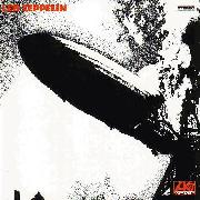 | Led Zeppelin
Led Zeppelin
This picture of the tragic demise of the Hindenburg is one of my favorite historical pictures of all time. The angle of the photo, its scale, the cultural and historical significance behind it. A quintessential photograph that managed to become a classic a second time, now thanks to one of the most popular bands in rock |
| 57 |  | Santana
Santana
The lion is made out of people! :D |
| 58 | 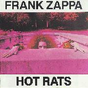 | Frank Zappa
Hot Rats |
| 59 | 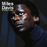 | Miles Davis
In a Silent Way
I think the same I said about Bookends applies to this one. Turtle necks are awesome btw |
| 60 | 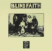 | Blind Faith
Blind Faith
One of the most controversial artworks ever. I included this one because, unlike Virgin Killer which would create a similar controversy a few years later, Blind Faith's is much more ambiguous in its proposition
While Virgin Killer has an obvious sexual innuendo behind it, Blind Faith lays more into a gray area that creates questions such as: Can nudity be art? Is nudity always bad? Is a naked minor automatically a degenerate's picture or are the ones offended by it the ones with the actual dirty minds searching for phallic objects and sexual intentions which aren't there?
On one hand Siedemann's artistical concept for the picture lacks any kind of sexual undertone, but it is also true that the girl got paid in money instead of the "pony" her sister promised. If anything, it is a cover that creates debate (instead of pure hate like Virgin Killer's) which is something that's normal in art but certainly not in album artworks. I really do like the airplane sculpture in any case |
| 61 |  | Scott Walker
Scott 3
I love the colors on this one |
| 62 |  | Victor Jara
Pongo en tus manos abiertas...
The hands of a working man really encapsulate the sound of one of the most important and influential figures in folk and protest music such as Victor Jara. As he "puts his music into your open hands", it does represent pretty well the social weight behind Jara's lyrics |
| 63 |  | The Who
Tommy
I have a thing for grid/diamond patterns |
| 64 |  | Deep Purple
Deep Purple |
| 65 |  | Free
Free
In my opinion this one is a way better version of the concept behind whatever it is that Lorde's Solar Power tried to do |
| 66 |  | Fleetwood Mac
Then Play On |
| 67 |  | Gal Costa
Gal |
| 68 | 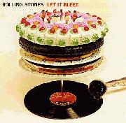 | The Rolling Stones
Let It Bleed
It reminds me of the style that a few years later Hipgnosis would make so popular and, as the creators of many of my favorite artworks ever, I can't help but like anything similar to that vibe |
|