|
User
Reviews 29
Approval 97%
Soundoffs 31
News Articles 6
Band Edits + Tags 54
Album Edits 109
Album Ratings 906
Objectivity 92%
Last Active 04-07-18 8:10 am
Joined 01-06-15
Review Comments 315
| ArtBox's Art Box Week 7: James Mercer's Artwork
Another round of Art Box is back with the subjectivity and low views. This week is not band-specific, but member-specific (to kind of make up for the really short Beastwars list). Thus, we're looking at the studio album artwork of James Mercer's three main projects over his career: Flake Music, The Shins and Broken Bells. | | 7 |  | Flake Music
When You Land Here, It's Time To Return
If we were talking about the 2014 reissue artwork, perhaps this would be higher. However, I think the grainy and washed-out look of the original does not hold up well. The happiness of the image itself also seems to contrast with the band's frenetic energy, or the insecurity found in Mercer's lyrics and in Mercer himself. I mean, I'm not sure if the reissue cover does either, but it's more distinct, at least. | | 6 | 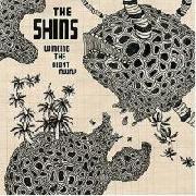 | The Shins
Wincing the Night Away
I can't say it's a bad cover album. In fact, I do like the idea of trying to capture something more alien onto the physicality of something real, like a math textbook. Palette-wise however, I feel like it conveys a sense of hopelessness around the alien, and it's disheartening. Or it's too monochrome for me to put it above the other artwork. Either way, it's my least favourite out of The Shins' artwork. | | 5 | 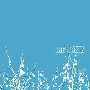 | The Shins
Oh, Inverted World
Now here we go. A bright and open blue sky, full of possibilities - yet still grounded by white tendrils slipping in,taking hold, making sure we don't go too high up. Is that for better or for worse? Probably both. Does it matter? That depends. To get super cheesy, maybe the bright blue sky is the place where Mercer sends all his soaring melodies. | | 4 | 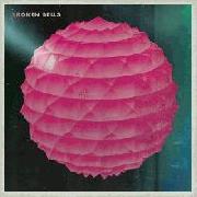 | Broken Bells
Broken Bells
Broken Bells has not been on my listening list, so I can't comment on any relation between the artwork and the music. That said, Broken Bells have a bloody nice aesthetic. It may look like a expensive, elaborate circular paper lampshade beckoning you inside - but it's a cool looking expensive, elaborate paper lampshade. Broken Bells: making pink look good on album artwork since 2010. | | 3 | 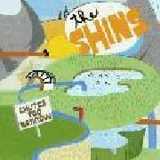 | The Shins
Chutes Too Narrow
It's got the colour of the pop music and the small reminders of Mercer's insecurity (the submarine scopes have eyes). It's a mishmash of colour, a world entirely of The Shins, to hell with the physics of water and hyper-realistic geography, this is ART, man. Even the sign, man. Welcome to Chutes Too Narrow, enjoy your stay, maybe. At this point I'm not entirely sure why I like it as much as I do. I just really do like it. | | 2 | 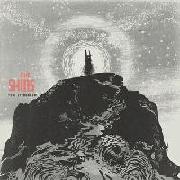 | The Shins
Port of Morrow
"How come the other monochrome thing gets #6 but this gets #2?" Better art style, for instance. It's also a logical conclusion to Mercer's journey from a sad and awkward young man to a happy and awkward old man. He stands upon the top of the misty mountain, and even though he's had to leave some people behind along the way ("aesthetic decision", come on, Mercer), as the snow rains down, he's achieved his goal. He finally feels like he's made it, even if he's been standing on top of the mountain this whole time. The only thing left to do is come back down. | | 1 | 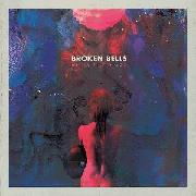 | Broken Bells
After The Disco
Once you've reached the top of the mountain, where's the logical next step? Probably the next highest mountain, but failing that, space. And what a beautiful place space is, if Mercer and Danger Mouse have it their way. It's a space where all the colours run together. Even this space looks exotically familar, with the lone celestial figure underneath the shining disco ball after the disco (sick title plug there good one). If Mercer wants to explore the space between the ethereal and the physical after all this time, I can't blame him. By the looks of it, there'd be a lot of sights to see. | |
|