Album Rating: 4.5
wait are we talking about the original album cover or the 2005 one?
Because the 2005 is tuff
|
| |
Album Rating: 1.5
The one here sucks
The newer one’s lit
|
| |
Album Rating: 3.0
the newer one is of the same piece so idk how one can be better than the other
the monster looks cooler yea but still
|
| |
Album Rating: 1.5
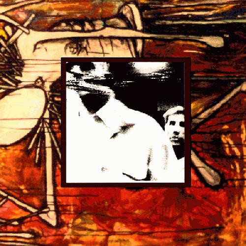
https://imgur.com/a/AaH1EgP
Not really, this one has different colours and doesn’t have that ugly ass photo in the middle
|
| |
Album Rating: 4.0
UGLY?
|
| |
Album Rating: 1.5
Yes
|
| |
Album Rating: 3.5
Both covers are hideous.
|
| |
Album Rating: 3.5
I prefer the other one by far, I actually like it
|
| |
Album Rating: 3.5
Nice dig!
|
| |
Album Rating: 4.0
Agreed Xing, on the covers that is.
|
| |
Album Rating: 4.5
Yeah Jacob has had great album art since Jane Doe, but the original Petitioning and WFCC covers are awful. The 2005 version looks better on both by far.
|
| |
Album Rating: 3.5
I like both covers of WFCC. but Jane Doe, No Heroes, and Axe to Fall really have the best album art
|
| |
Album Rating: 4.5
Regardless of what you think about the actual album, I really dig The Dusk In Us artwork too.
I Can Tell You About Pain 7" had some nice art too
|
| |
Album Rating: 4.0
axe to fall artwork is best easily
|
| |
Album Rating: 4.0
idk I always thought that the monster on the cover is a great representation of the sound of this album, at least some of the more frantic songs like The Saddest Day and Color Me Blood Red. and it looks cool imo, I've had it as my profile picture here on sput since forever haha
|
| |
Album Rating: 4.0
???????????????????????????
|
| |
Album Rating: 3.0
Farewell Note to This City
is good
|
| |
Album Rating: 3.0
Mmmh the second half of my comment has been cut away for some reason.
Anyway, nope boi
|
| |
Album Rating: 3.5
Use the edit function comrade
|
| |
Album Rating: 4.5
ya second best behind dead
|
| |
|
|