|
User
Reviews 5
Approval 86%
Soundoffs 141
News Articles 1
Band Edits + Tags 7
Album Edits 27
Album Ratings 1533
Objectivity 57%
Last Active 12-14-21 7:54 pm
Joined 01-20-14
Review Comments 13,258
| Some Great Album Artwork
I'm always taken in by interesting album covers. These are all albums I have rlistened to before. rrWhat are some that you think are great? | | 1 | | Arctic Monkeys
Whatever People Say I Am, That's What...
Simple, yet effective. We are greeted by a man smoking a cigarette. Is he cool? Does
he even care? He seems to be in a haze of a night out. Something about him just
makes you want to hang out with him, but he is pretty average. Not particularly
handsome. No fancy hair. Just a white button down shirt and slinted eyes staring
right at you. It corresponds well with the music; a bunch of alternative rock dance
tunes that explain friends' adventures through the night. | | 2 | 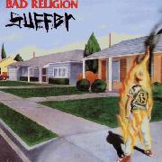 | Bad Religion
Suffer
A boy on fire is not a soothing sight. Normally, he would be on the floor, screaming
from the pain of his skin sizzling due to the intense flames. Yet, this boy stands upright
and wearing a Bad Religion t-shirt. Around the boy is... well, normality. Everything is
calm. A quiet little suburban neighborhood. Is he supposed to be a metaphor for the
band, feeling like they are forced to burn and take it in this world? Or maybe a
metaphor for the demolition of religion forced onto young boys? | | 3 | 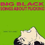 | Big Black
Songs About Fucking
One look at this and you know you are in for a rough ride (har har). The neon green of the
album really brings attention to your eyes. The woman in the corner is obviously having
something intense done to her, and from the giant "fucking" at the top of the album, we
are left to assume she is getting it good. Much like the music, it's in your face and sharp. | | 4 |  | Brand New
The Devil and God Are Raging Inside Me
Other than being Sputnik's trophy wife, the thing that really drew me in to listen to this
album was the artwork. It's intriguing. We have two strange gentlemen standing on the
steps of a beat down house and they are obviously dressed to be scary. Then we have
a little innocent looking girl hiding from them. However, she is not running. In fact, she
looks like she wants to know what is going on. Could it be a metaphor? | | 5 |  | The Dismemberment Plan
Emergency & I
I actually prefer the original artwork to the one posted on this site, but both are
great. It is clearly the world we live on, yet it isn't. Everything is broken down into
simplistic shapes... arcs, triangles, rhombuses, lines... and the color variation is
crazy. The ground is striped... blue. The sky is faded into what looks like sundown,
yet the sun is still there. In the center is an unidentified creature with multiple legs
that bend over it. You think... is this how the band sees things? Do they feel like
they are living in a place where they don't fit in? | | 6 |  | Manic Street Preachers
The Holy Bible
Quite a bold move making this their album cover and calling the album one of the holy
books. But, then again, the Manics don't really care do they. It is a statement, just
like the music. One of the seven deadly sins is gluttony and the woman in this picture
is clearly sinning according to religion. Yet, the Manics model her. Showing her in
three different stances and exemplifying irony with the title. | | 7 |  | My Bloody Valentine
Loveless
If I had to pick an album cover that best suits the music from the album, it would be this
one. The guitar is clearly the main instrument used and is the focus of the artwork. But
the focus is not so focused. It's a blur. A haze. A pink, red, and black mix of colors to
entrance your eyes. The pink could be there to exemplify that a soft feminine voice will
be soothing your eardrums. Or it could be there just to fuck with you. | | 8 | 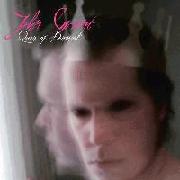 | John Grant
Queen of Denmark
What is it like to feel like you don't fit? Everybody seems to be judging you for what
you want to be. The "Queen of Denmark" is exaggeration. Just because he is gay,
people expect him to be effeminate and feisty. And then we have the solid black eyes,
saying that there are also people who see him as a demon. A gay girly demon boy who
stares out of his window just wanting acceptance. | | 9 | 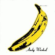 | The Velvet Underground
The Velvet Underground & Nico
I mean, its a Warhol and I am a fan of his. What statement could be made from an over
ripening banana? To me, weirdness. Much like the music on the album, it is quite
strange. Especially for it's time. A giant yellow banana will also catch your attention and
help you remember. | | 10 | 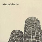 | Wilco
Yankee Hotel Foxtrot
The two buildings pictured on this cover are very interesting to look at, especially in
person. The architecture is fascinating. Especially how it messes with your eyes as
you move. Pictures of the towers seem drawn. Anyway, the cover itself is very
simplistic. Empty. The sky is an odd tan color that is not pleasing. It stands there with
the melancholy music of the album. | |
AmericanFlagAsh
09.05.14 | Sigh. I don't know why the first isn't showing up. | danielcardoso
09.05.14 | Agreed on 9. | AmericanFlagAsh
09.05.14 | That one was an obvious choice for me. | Phobonnika
09.05.14 | I like what Varg does with a lot of his artworks: fitting paintings by Kittelsen. I often find a sinister image with little wording makes for the best fit - something like LZIV. Leaves it ambiguous and indifferent. I don't like 4 as a musical outing, I don't really understand what all the Sputnik fuss is about, but i agree that the artwork is intriguing. | AmericanFlagAsh
09.05.14 | Yeah the LZIV artwork is pretty cool. Have never listened to a LZ album though. |
|