Nothing to do with the bands they supposedly ripped off right?
|
| |
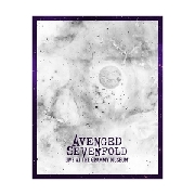
lol all of their album covers have been terrible, this is no different
|
| |
it looked better before
|
| |
so lazy!!! do SOMETHING different...
|
| |
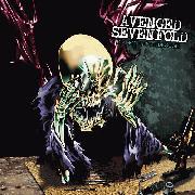
wow it looks so similar to their self-titled and wtf
|
| |
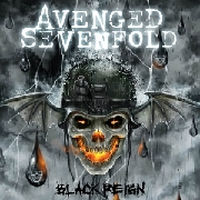
Are there bats?
|
| |
this needed a news article
|
| |
The single cover and the new album cover both look so much better than the first image.
|
| |
Single cover is best
Way to cave in to peer pressure, you pansies
|
| |
The artwork is as boring as the single.
|
| |
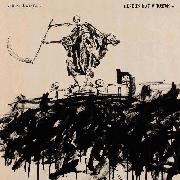
Sounding The Seventh Trumpet looked great and the Waking The Fallen artwork (inside the sleeve) was great too.
|
| |
but really though, why pander like that? it's fucking stupid, it's your art do whatever the fuck you want. damn.
|
| |
Way to cave in to peer pressure, you pansies[2]
|
| |
That album cover honestly looks much more like a single cover than the cover they want to be the single cover.
|
| |
Sounding The Seventh Trumpet looked great and the Waking The Fallen artwork (inside the sleeve) was great too. [2]
but yeah, this sucks dick
|
| |
Absolutely shit artwork for an absolutely shit band. Go figure.
|
| |
Cover ain't so bad. Hearing "hail to the king" always reminds me of Showbread's track "Dead by Dawn."
|
| |
cool so they know how to use the zoom function
|
| |
and the c+p function
|
| |
Are they even TRYING to be original at this point?
|
| |
#FreeVarg
|
| |
changing your album art last minute because some people didn't like it? who does that?
|
| |
That single cover is still laughably bad.
|
| |
New one's shitty.
You've already had 2 albums with the same cover, at least have your album cover be non-generic
|
| |
...That SUCKS, I liked the cover to the single...
|
| |
Why did they take the BAD version of the single's artwork, and give the SINGLE better artwork instead? (I use 'better' loosely, of course)
|
| |
not gonna lie i think that cover art is pretty cool
|
| |
The first one reminds me of A Nightmare Before Christmas
|
| |
lol how did i know there was going to be a skull and a crown on this before i even looked at it
|
| |
this is good
FOR ME TO POOP ON!!!
|
| |
most generic cover ever
|
| |
FreeVarg
------------------
Where? I am tired of paying for it!
|
| |
This band has so many fresh ideas!!
|
| |
Eh, this one also sucks.
|
| |
The last cover wasn't exactly good, but at least it was different. Some fans start bitching, and somehow they think it's an improvement to use the same damn logo they used two times already. Way to be whores.
|
| |
Lame.
|
| |
It's just Waking The Fallen but zoomed in on the right lol
|
| |
That is almost the same cover as Waking the Fallen. I don't want to say this, but how dare they trick
fans into thinking this would be similar to Waking the Fallen. Shadows' vocals are so boring and
predictable these days.
|
| |
lmao good point treb. i thought the first cover was funny and then it got worse.
|
| |
lol that cover is soo bad.
|
| |
I honestly hope the music makes up for the rather underwhelming cover, or I will be pretty frustrated.
|
| |
I'd rather focus on the fact that they're touring with Deftones and Ghost.
Yes (Ghost)
Hell Yes (deftones)
and Fuck No (A7X)
looks like I'll be overpaying to leave early.
|
| |
Well this is just embarrassing
|
| |
wait so was the first artwork just single artwork? because i remember seeing that up on their website in advertisement for the single. maybe the new artwork was always supposed to be the artwork
either way though you can't just do that 3 times
|
| |
pretty much
|
| |
Doesn't change the fact the music will suck.
|
| |
So they took the self titled album art and cut it in half, does that mean the music will be half as good?
|
| |
this is good
FOR ME TO POOP ON!!! [2]
|
| |
Wow. So imaginative.
|
| |
i'll CRAP ON IT FIRST!
|
| |
Apparently this cover is just a color-inversed version of one of their demos
Jesus Christ this band is so fucking lazy
|
| |
Well, it's pretty lazy/boring/simple, and it's pretty much the same as the Waking the Fallen and S/T covers, but at least it doesn't look like total ass like the original cover. It looks professional, if not exciting. Also, to those praising the single cover: you realize the only difference is that they put a sepia filter on it, right?
|
| |
huh since when has anything album-art related been news?
|
| |
Still looks shitty
|
| |
At least they are breaking new ground with this one.
|
| |
Wow I can't believe this thread! Just goes to show people will bitch about anything!! The old and new cover are genius and the cd will be their best work ever anyway!!! Why y'all hatin'?
|
| |
huh since when has anything album-art related been news?
since always if the band is big enough, dumbass
Wow I can't believe this thread! Just goes to show people will bitch about anything!! The old and new cover are genius and the cd will be their best work ever anyway!!! Why y'all hatin'?
this must be your first a7x thread
|
| |
''M Shadows exclusively told us earlier this year that the album has a Sabbthy, Led Zeppelin kinda vibe''
lol
|
| |
way to go backwards
|
| |
I prefer this band's music to most of these comments...
|
| |
gold
|
| |
i think people on here collectively talk shit because even if they don't agree with someone on something else, they can most of the time be assured that the other person does not like a7x
either that or they don't like the music idfk but this album will most likely be a 2 at best and i don't even hate this band
|
| |
And by "brand new" they mean "we used this for our 2000 Demo, nobody remembers that though, right?". We do. http://www.sputnikmusic.com/soundoff.php?albumid=74816
|
| |
^that's just..
|
| |
lmao i completely forgot that demo existed
|
| |
You all care way too much about an album cover
|
| |
yo, it's the fucking 2000 demo inverted
|
| |
Honestly, this is so wrong. It is just too ridiculous to see A7X fans bashing around about the album cover being ugly ... but City of Evil (that album cover is the embodiment of bad cheesiness) was "cool", sure! I really wonder how many "fans" of the band out there actually know more than the last two albums they put out.
Also the new album art is like a joke, especially after the Nightmare cover, which was the only A7X cover I could stand.
|
| |
Well, it's definitely not better than that single cover.
|
| |
City of Evil cover? Lol look at it again. It isn't an eye sore but it sure is a mess. I think simple
and/or abstract covers are better.
|
| |
Is it just me that think they're being ballsy not putting their name on it? or is the deathbat really that well known?
|
| |
It's well known to the die hards, who will probably be the only ones purchasing this.
|
| |
maybe theyre trying to confuse the overkill fans
|
| |