|
User
Reviews 29
Approval 97%
Soundoffs 31
News Articles 6
Band Edits + Tags 54
Album Edits 109
Album Ratings 906
Objectivity 92%
Last Active 04-07-18 8:10 am
Joined 01-06-15
Review Comments 315
| ArtBox's Art Box Week 8: The Jesus and Mary Chain
To paraphrase the majority of rap intros, you know who it is. Or you know what time it is. 6 studio album covers to rank, let's go. | | 6 |  | The Jesus and Mary Chain
Honey's Dead
Props for looking like a proper "Dawn of the Dead" audition reel.
But god damn, it's an ugly cover. Like, I like The Jesus and Mary Chain, but a lot of these covers are just grimy, man. | | 5 | 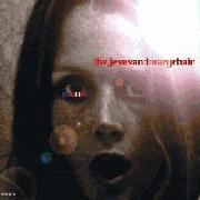 | The Jesus and Mary Chain
Munki
God damn, it's an ugly cover [2]. Almost identical to Honey's Dead.
At least it has a less fuzzy colour palette. Nicer cover on the eyes, JJ Abrams lens flare aside. | | 4 | 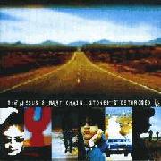 | The Jesus and Mary Chain
Stoned & Dethroned
I also would enjoy a show reel of myself on the open road, Brothers Reid, but I don't think it would qualify as a very exciting album cover. It is representative of one true thing though: the album is very good road music. | | 3 | 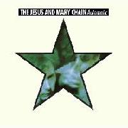 | The Jesus and Mary Chain
Automatic
Not particularly appealing visually. The Jesus and Mary Chain are big stars now, can't you tell by how they're inside the big star? And yet they still look blurry and fighting in the star, so you can tell there's a bit of danger?
At the very least, this is the first cover that has a semblance of proper organisation. | | 2 | 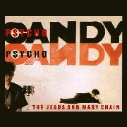 | The Jesus and Mary Chain
Psychocandy
Paint me like one of your Scottish noise rock pre-shoegaze heroes.
I do like the inverted N. It's got a clear mission statement: We are the Reids, and you can expect us to be disinterested yet playful. A pink background, like the bubblegum pop hidden behind the ridiculous layers of feedback. One snare, minimalist like the rest of the cover. It's focused in what it wants to be, much like Psychocandy itself. | | 1 | 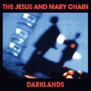 | The Jesus and Mary Chain
Darklands
"We're not The Cure, we promise" should really be the caption of this album art.
Bias for the album aside, it really is a lovely looking cover. Mostly because it's the only time the Reids go against type on their album covers, making themselves look like goth rock heroes instead of the Shangri-Las bishops that they were. Sure, they're moody, but the album covers are never particularly serious in mood, and this comes off as a well-balanced parody of that gothic image. | |
zakalwe
10.29.16 | 6 is massively underrated | wtferrothorn
01.13.17 | Hey Art, where do you think the new album's art would rank? | ArtBox
08.23.17 | Only saw this like seven months late, damn
Bowl lighting's good and the alphabet soup looks shambolic like the band, would probably slot it above S&D but below Automatic | ArtBox
08.23.17 | I think I'd agree more with you now, yeah
Definitely didn't like the zombie aesthetic a year ago though |
|