CK
09.05.13 | 1 and 2 are fairly even but whatever |
JamieTwort
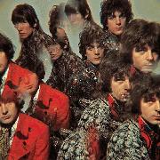
09.05.13 | 4 is 1 for me. One of my favourite album covers. |
evilford
09.05.13 | lol @ descriptions |
DominionMM1
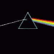
09.05.13 | Pink Floyd
The Dark Side of the Moon
really not that cool
dude.......ugh |
CK
09.05.13 | It's a fucking prism. It not that interesting |
DeathGrinder
09.05.13 | List sucks. |
TheSpaceMan
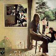
09.05.13 | 3s my favorite. All of Floyd's covers match their sound so well |
TheSpaceMan
09.05.13 | DSOTM has a perfect cover wtf |
ButteryBiscuitBass
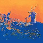
09.05.13 | 1 is cosmic. Animals is iconic though. |
Rowan5215
09.05.13 | Yeah Darkside is iconic dude. 3 is way too high even the art makers admitted they copped out on that one. |
evilford
09.05.13 | yeah even if the art for dark side, in and of itself, isn't that aesthetically pleasing, it's symbolism in context to the album makes it prob my fav pf art.
also yeah animals and WYWH rule
but 13 - "A kindergartener's artwork"...same thing with this and dark side...do you know what that image is? |
Rowan5215
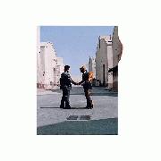
09.05.13 | I would've put WYWH way higher, the symbolism behind that image is incredible. |
StallionMang
09.05.13 | Pretty good list, all of PF's album covers range from great to absolutely incredible (except maybe The Wall). |
TheSpaceMan
09.05.13 | WYWH should be higher agreed |
StallionMang
09.05.13 | There's a "night version" of Division Bell? That sounds pretty sweet. |
evilford
09.05.13 | I actually find 1 to be one of their most boring artworks (and albums) |
dmp3131
09.05.13 | Animals would easily be my number 1.
|
Minus.
09.05.13 | So everyone got bored of ranking Floyd albums so now people are ranking the artwork? |
Rsetness9
09.05.13 | 4 is 1 |
wacknizzle
09.05.13 | I always loved the art for Ummagumma because it's like an infinite mirror, too bad the album is meh as meh |
NeroCorleone80
09.06.13 | 2 is 1 |
demigod!
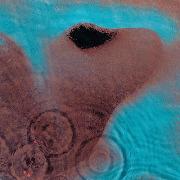
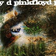
09.06.13 | i always thought that meddle's art was an upside down nose |
NeroCorleone80
09.06.13 | Looks like a camel to me |
BigPleb
09.06.13 | Dumbest list ever. |
CK
09.06.13 | Yeah until I actually read what it was I thought it was a camel too |
TheSpaceMan
09.06.13 | wheres the camel? the grayish-maroon stuff? |
Artuma
09.06.13 | 2 and 4 are the best |
NeroCorleone80
09.06.13 | "wheres the camel? the grayish-maroon stuff?"
Nah if you look closely you'll see what looks like the head of a camel |
guitarded_chuck
09.06.13 | Atom Heart Mother #1 |
frigyourgenre
09.06.13 | the inside of the wall gatefold is #1 |
Greem
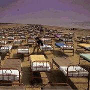
09.07.13 | 11 is 1 |
TheSpaceMan
09.07.13 | "Nah if you look closely you'll see what looks like the head of a camel"
I guess I can see a camel with a bullet hole where its brain should be |
JokineAugustus
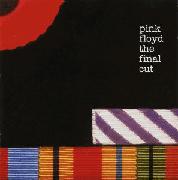
09.07.13 | 10 should be way higher |
avonbarksdale221
09.07.13 | 11 is 1. Shit is iconic, yo. |
TheSpaceMan
09.08.13 | does higher mean better or worse? |
IbenizGEO1
09.08.13 | DAT ASS |
JokineAugustus
09.08.13 | 10 should be a lower number on this list. |
dante1991
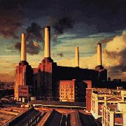
09.13.13 | 8's image is an awesome piece of photography (album sucks though).
3's an ear, eh? I always thought it was a nose close-up haha!
13 is BY FAR the worst! I get that it was trying to be symbolic and stylish to the theme of the album, but it just looks really chucked together and cheap. |
tommygun
09.30.13 | madcap laughs |
Parallels
09.30.13 | 1 is a horrible album cover.
3 and 4 are the best |
tempest--
09.30.13 | Atom Heart Mother has fuckin sweet colours like the grass and sky opposing each other and the black/white of the cow wow so good storm thorgerson rules |
OmairSh
09.30.13 | 3 is a camel |
Parallels
09.30.13 | dude storm did like all of these covers |
evilford
09.30.13 | 11 is 1 [69] |
tempest--
09.30.13 | i kno |